Card#
CardInterface #
Specs for Card Interface.
Implementation#
Card #
Card(
    *,
    content: LayoutItem,
    header: TemplatedStringItem | CardHeader | None = None,
)
Groups content with widgets, grids, and selectable sections.
The Card class is a fundamental component in a dashboard layout, allowing users to group and organize content. It provides a container for various layout items such as widgets, cards, grids, and selectable sections.
Constructor for Card.
Parameters:
| Name | Type | Description | Default |
|---|---|---|---|
content
|
LayoutItem
|
content within the Card. One of Widget, Card, Grid, SelectableSection. |
required |
header
|
TemplatedStringItem | CardHeader | None
|
Header card spec. Defaults to None, i.e. a card without title. |
None
|
Examples:#
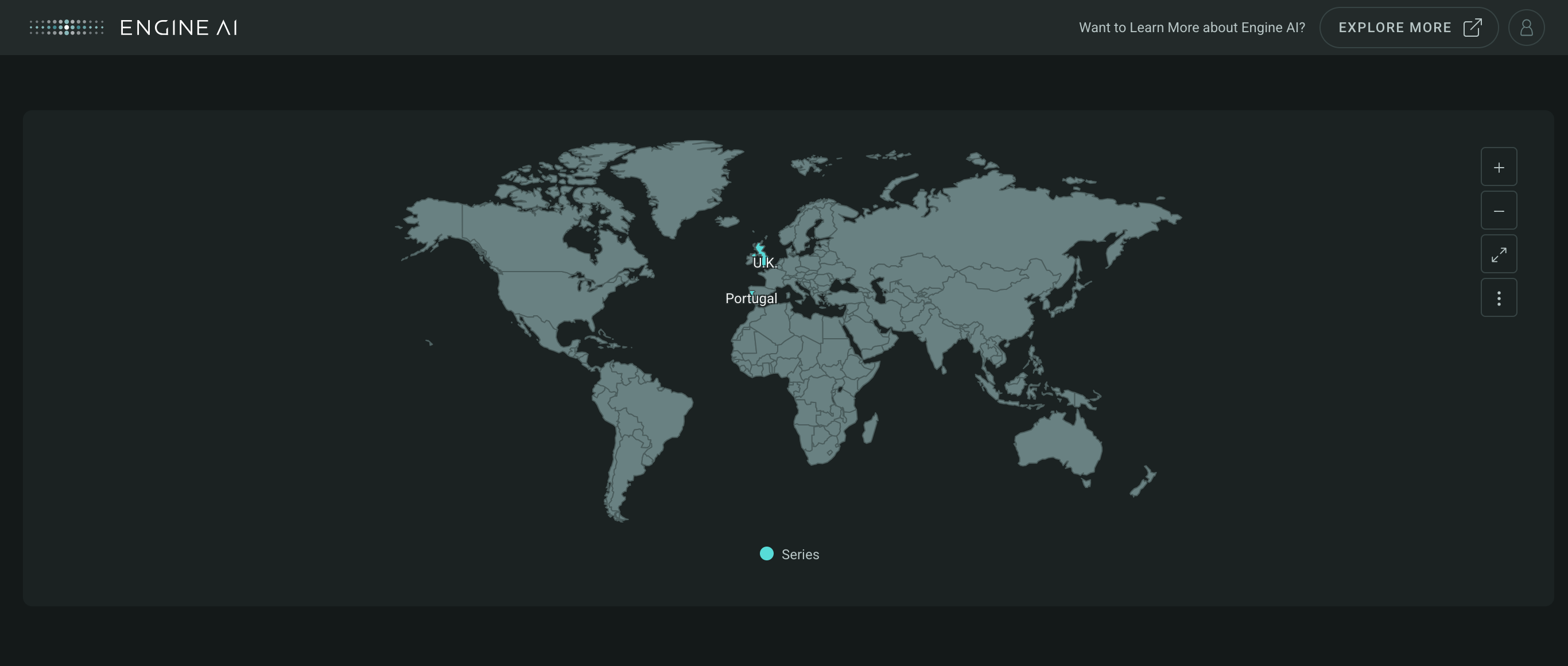
Create Card with widget
import pandas as pd

from engineai.sdk.dashboard import layout
from engineai.sdk.dashboard.dashboard import Dashboard
from engineai.sdk.dashboard.widgets import maps

data = pd.DataFrame(
    data=[{"region": "PT", "value": 10}, {"region": "GB", "value": 100}]
)

Dashboard(
    workspace_slug="my-workspace",
    app_slug="my-app",
    slug="first-dashboard",
    content=layout.Card(content=maps.Geo(data=data))
)
Result:
CardHeader #
CardHeader(
    *chips: CardChip,
    title: TemplatedStringItem | None = None,
)
Provides card title and chips for additional information.
The CardHeader class represents the header of a card, providing additional information such as title and chips.
Constructor for CardHeader.
Parameters:
| Name | Type | Description | Default |
|---|---|---|---|
chips
|
CardChip
|
chips to be added to the card header. |
()
|
title
|
TemplatedStringItem | None
|
Card title. |
None
|
Examples:#
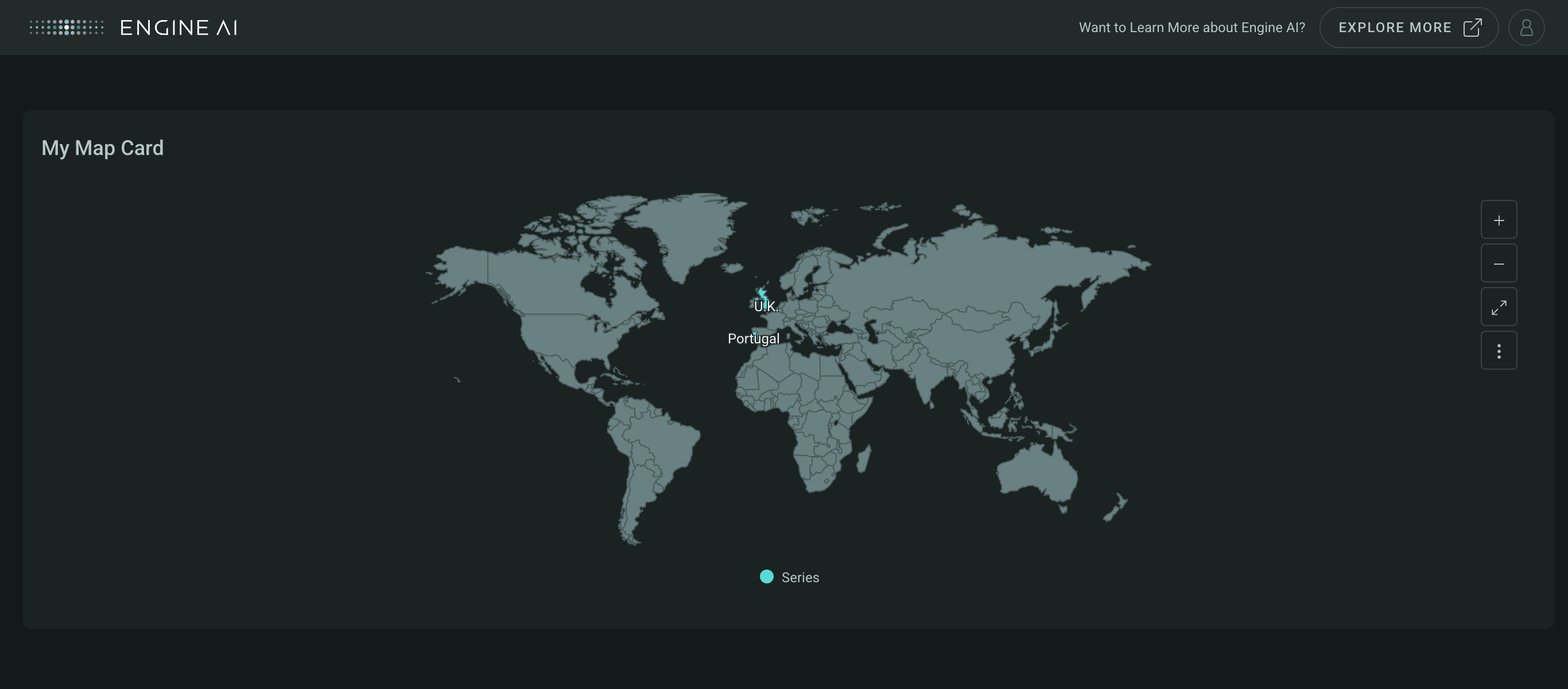
Create Card with title
import pandas as pd

from engineai.sdk.dashboard import layout
from engineai.sdk.dashboard.dashboard import Dashboard
from engineai.sdk.dashboard.widgets import maps

data = pd.DataFrame(
    data=[{"region": "PT", "value": 10}, {"region": "GB", "value": 100}]
)

Dashboard(
    workspace_slug="my-workspace",
    app_slug="my-app",
    slug="first-dashboard",
    content=layout.Card(
        header=layout.CardHeader(title="My Map Card"),
        content=maps.Geo(data=data)
    )
)
Result:
CardChip #
CardChip(
    *,
    label: str | GenericLink,
    tooltip_text: list[TemplatedStringItem] | None = None,
    prefix: str = "",
    suffix: str = "",
)
Labels or links within a card header for additional context.
The CardChip class represents individual chips within a card header, providing additional labels or links.
Constructor for CardChip.
Parameters:
| Name | Type | Description | Default |
|---|---|---|---|
label
|
str | GenericLink
|
Card Header label value. Can assume a static label or a single GenericLink. |
required |
tooltip_text
|
list[TemplatedStringItem] | None
|
informational pop up text. Each element of list is displayed
as a separate paragraph. Can only use this option if the |
None
|
prefix
|
str
|
prefix value to use in before each label. |
''
|
suffix
|
str
|
suffix value to use in after each label. |
''
|
Examples:#
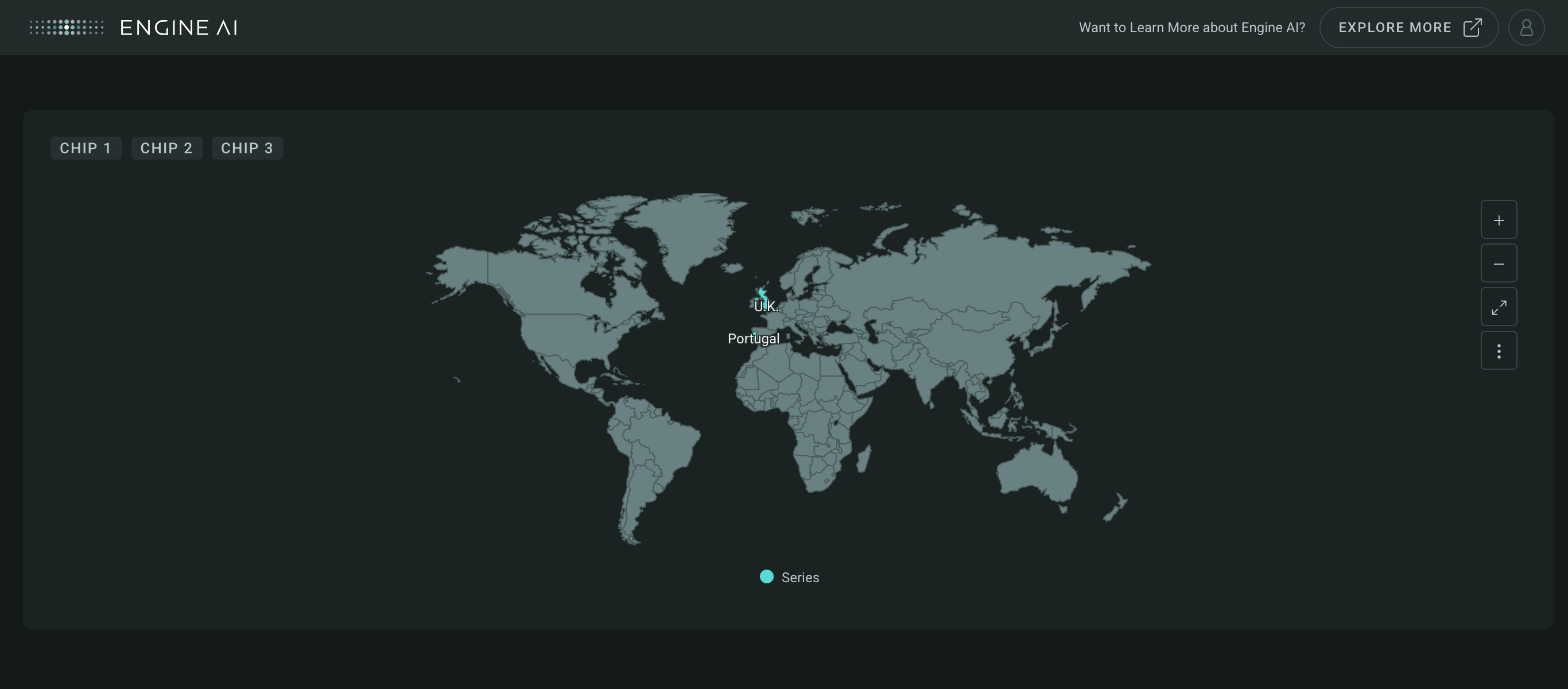
Create Card with multiple chips
import pandas as pd

from engineai.sdk.dashboard import layout
from engineai.sdk.dashboard.dashboard import Dashboard
from engineai.sdk.dashboard.widgets import maps

data = pd.DataFrame(
    data=[{"region": "PT", "value": 10}, {"region": "GB", "value": 100}]
)

Dashboard(
    workspace_slug="my-workspace",
    app_slug="my-app",
    slug="first-dashboard",
    content=layout.Card(
        header=layout.CardHeader(
            layout.CardChip(label="Chip 1"),
            layout.CardChip(label="Chip 2"),
            layout.CardChip(label="Chip 3")
        ),
        content=maps.Geo(data=data)
    ),
)
Result: