Table#
Table #
Table(
    data: DataType | DataFrame,
    *,
    columns: TableColumns | None = None,
    widget_id: str | None = None,
    title: WidgetTitleType = None,
    styling: TableStyling | None = None,
    row_selection: int = 1,
    rows_per_page: int = 10,
    initial_state: InitialState | None = None,
    has_search_box: bool = False,
    has_filter_row: bool = False,
    has_header_filter: bool = False,
    group_columns: list[Group] | None = None,
)
Construct table widget.
Construct a table widget with customizable parameters such as data source, columns, title, styling, row selection, pagination, search box, and more.
Constructor for Table widget.
Parameters:
| Name | Type | Description | Default |
|---|---|---|---|
data
|
DataType | DataFrame
|
data to be used by widget. Accepts DataSource as well as raw data. |
required |
columns
|
TableColumns | None
|
header(s)/column(s) into the Table Widget. When this is of type string, it is assumed to be a text column. |
None
|
widget_id
|
str | None
|
unique widget id in a dashboard. |
None
|
title
|
WidgetTitleType
|
title of widget can be either a string (fixed value) or determined by a value from another widget using a WidgetField. |
None
|
styling
|
TableStyling | None
|
styling of table widget. |
None
|
row_selection
|
int
|
number of rows that can be selected. |
1
|
rows_per_page
|
int
|
number of rows shown in each page. |
10
|
initial_state
|
InitialState | None
|
initial state of table widget. |
None
|
has_search_box
|
bool
|
show search box. |
False
|
has_filter_row
|
bool
|
show filter row. |
False
|
has_header_filter
|
bool
|
show header filter. |
False
|
group_columns
|
list[Group] | None
|
list of columns that should be grouped. |
None
|
Using Connectors
When using Connectors to get the data, add the columns to use in the the columns parameter,
otherwise the widget will not render correctly.
Examples:#
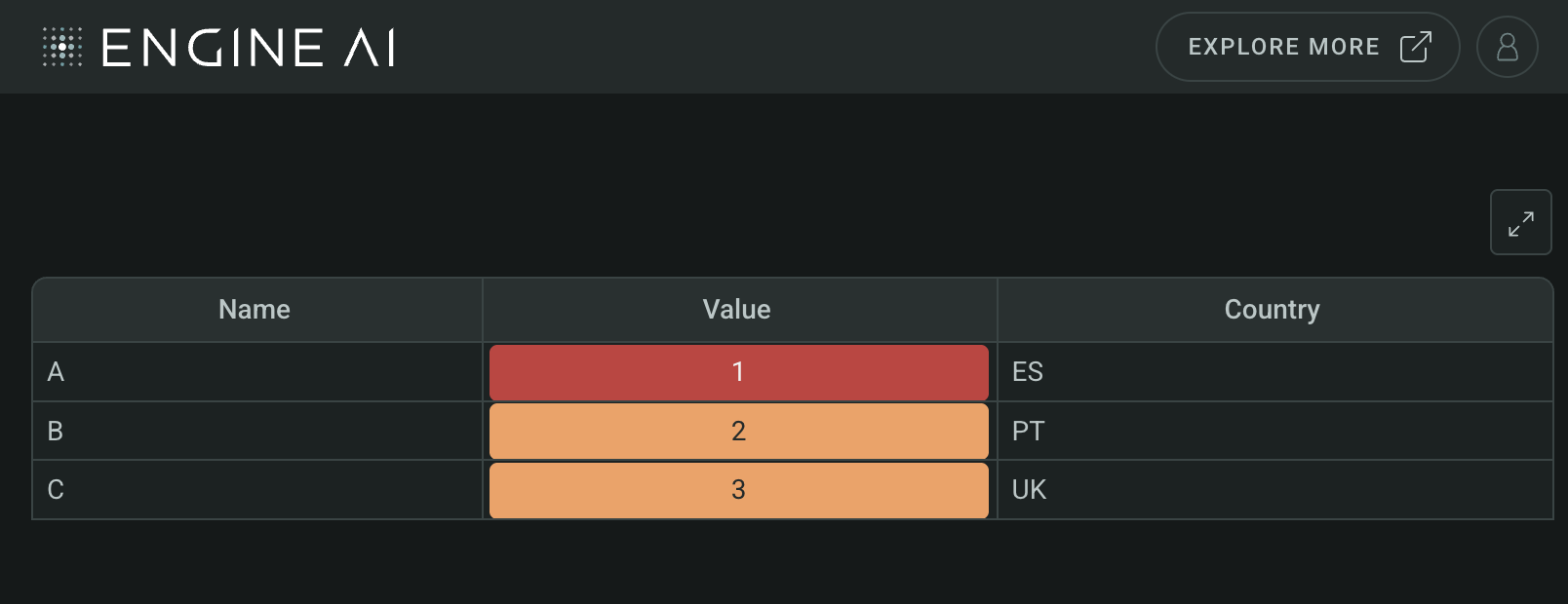
Create a minimal Table widget
import pandas as pd
from engineai.sdk.dashboard.dashboard import Dashboard
from engineai.sdk.dashboard.widgets import table

data = pd.DataFrame(
    {
        "name": ["A", "B", "C"],
        "value": [1, 2, 3],
        "country": ["ES", "PT", "UK"],
    },
)

table_widget=table.Table(data)

Dashboard(
    workspace_slug="my-workspace",
    app_slug="my-app",
    slug="first-dashboard",
    content=table_widget,
)
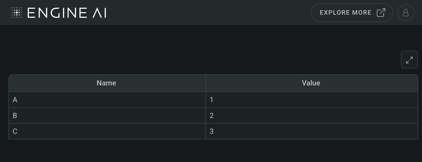
Create a Table with custom columns
import pandas as pd
from engineai.sdk.dashboard.dashboard import Dashboard
from engineai.sdk.dashboard.widgets import table

data = pd.DataFrame(
    {
        "name": ["A", "B", "C"],
        "value": [1, 2, 3],
        "country": ["ES", "PT", "UK"],
    },
)

table_widget = table.Table(data=data, columns=["name", "value"])

Dashboard(
    workspace_slug="my-workspace",
    app_slug="my-app",
    slug="first-dashboard",
    content=table_widget,
)
Data#
This widget works with tabular data, typically in the form of a Pandas DataFrame.
InitialState #
Define initial state for table widget.
Define the initial state for the table widget, including the default page, search text, and pre-selected rows.
Constructor for InitialState.
Parameters:
| Name | Type | Description | Default |
|---|---|---|---|
page
|
int
|
the default initial page. |
0
|
search_text
|
str
|
Initial string in the search box. |
''
|
selected
|
list[str] | None
|
List of rows pre-selected by default. |
None
|
TableStyling #
TableStyling(
    *,
    has_borders: bool = True,
    has_column_lines: bool = True,
    has_body_column_lines: bool = True,
    has_row_lines: bool = True,
    single_height_row: bool = True,
)
Visual styling options for table widget.
Specify the visual styling options for the table widget, including borders, column lines, row lines, and row height.
Constructor for TableStyling.
Parameters:
| Name | Type | Description | Default |
|---|---|---|---|
has_borders
|
bool
|
whether the outer border of the table are shown. |
True
|
has_column_lines
|
bool
|
whether vertical lines that separate columns are visible. |
True
|
has_body_column_lines
|
bool
|
whether vertical lines that separate body columns are visible. |
True
|
has_row_lines
|
bool
|
whether horizontal lines that separate rows are visible. |
True
|
single_height_row
|
bool
|
whether row has single height (True) or double height (False). |
True
|
Group #
Group(
    data_column: str | WidgetField, label: str | WidgetField
)
Define group column for table widget.
Define a group column for the table widget, which allows grouping rows based on specified columns.
Constructor for Group.
Parameters:
| Name | Type | Description | Default |
|---|---|---|---|
data_column
|
str | WidgetField
|
column that will be used to group the table rows. |
required |
label
|
str | WidgetField
|
table group label. |
required |
Headers#
Header #
Header(
    columns: TableColumns,
    label: str | GenericLink,
    tooltip_text: list[TemplatedStringItem] | None = None,
)
Specify header columns with optional tooltips for table widget.
Specify the columns to be displayed as headers above the normal columns in the table widget, along with optional tooltip text.
Constructor for Header.
Parameters:
| Name | Type | Description | Default |
|---|---|---|---|
columns
|
TableColumns
|
header(s)/column(s) into the Table Widget. When this is of type string, it is assumed to be a text column. |
required |
label
|
str | GenericLink
|
label to be displayed for this column. |
required |
tooltip_text
|
list[TemplatedStringItem] | None
|
info text to explain column. Each element of list is displayed as a separate paragraph. |
None
|
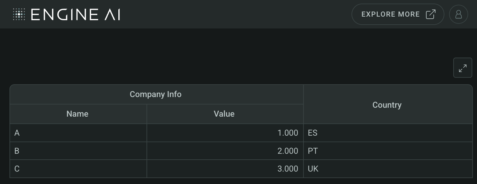
Example:#
Create a Table widget with header
import pandas as pd
from engineai.sdk.dashboard.dashboard import Dashboard
from engineai.sdk.dashboard.widgets import table

data = pd.DataFrame(
    {
        "name": ["A", "B", "C"],
        "value": [1, 2, 3],
        "country": ["ES", "PT", "UK"],
    },
)

table_widget = table.Table(
    data=data,
    columns=[
        table.Header(
            label="Company Info",
            columns=[
                "name",
                table.NumberColumn(data_column="value"),
            ],
        ),
        "country",
    ],
)

Dashboard(
    workspace_slug="my-workspace",
    app_slug="my-app",
    slug="first-dashboard",
    content=table_widget,
)
Columns#
AreaChartColumn #
AreaChartColumn(
    *,
    data_column: str | WidgetField,
    data_key: str | WidgetField,
    label: str | GenericLink | None = None,
    formatting: NumberFormatting | None = None,
    styling: Palette | AreaChartStyling | None = None,
    display_first_value: bool = True,
    display_last_value: bool = True,
    reference_line: ReferenceLineType | None = None,
    hiding_priority: int = 0,
    tooltip_text: list[TemplatedStringItem] | None = None,
    min_width: int | None = None,
    sortable: bool = True,
    optional: bool = False,
    tooltip: ChartTooltip | None = None,
)
Define table widget column area.
Define a column in the table widget that displays an area sparkline chart, including options for data, formatting, styling, and more.
Constructor for AreaChartColumn.
Parameters:
| Name | Type | Description | Default |
|---|---|---|---|
data_column
|
str | WidgetField
|
name of column in pandas dataframe(s) used for this widget. |
required |
data_key
|
str | WidgetField
|
key in object that contains the value for the line chart. |
required |
label
|
str | GenericLink | None
|
label to be displayed for this column. |
None
|
formatting
|
NumberFormatting | None
|
formatting spec. |
None
|
styling
|
Palette | AreaChartStyling | None
|
styling spec for area chart. |
None
|
display_first_value
|
bool
|
display first value before chart. |
True
|
display_last_value
|
bool
|
display last value after chart. |
True
|
reference_line
|
ReferenceLineType | None
|
reference line that will be added to the chart created. |
None
|
hiding_priority
|
int
|
columns with lower hiding_priority are hidden first if not all data can be shown. |
0
|
tooltip_text
|
list[TemplatedStringItem] | None
|
info text to explain column. Each element of list is displayed as a separate paragraph. |
None
|
min_width
|
int | None
|
min width of the column in pixels. |
None
|
sortable
|
bool
|
determines if column can be sorted. |
True
|
optional
|
bool
|
flag to make the column optional if there is no Data for that columns. |
False
|
tooltip
|
ChartTooltip | None
|
specs for tooltip. |
None
|
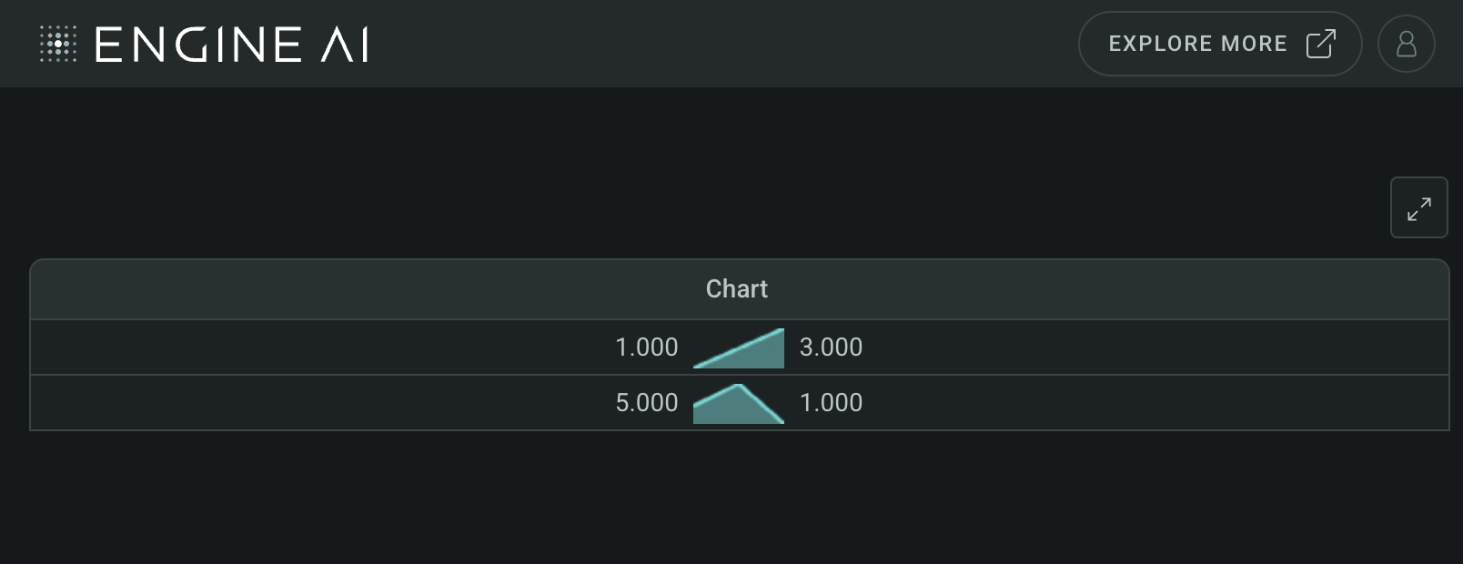
Example:#
Create a Table widget with AreaChartColumn
import pandas as pd
from engineai.sdk.dashboard.dashboard import Dashboard
from engineai.sdk.dashboard.widgets import table
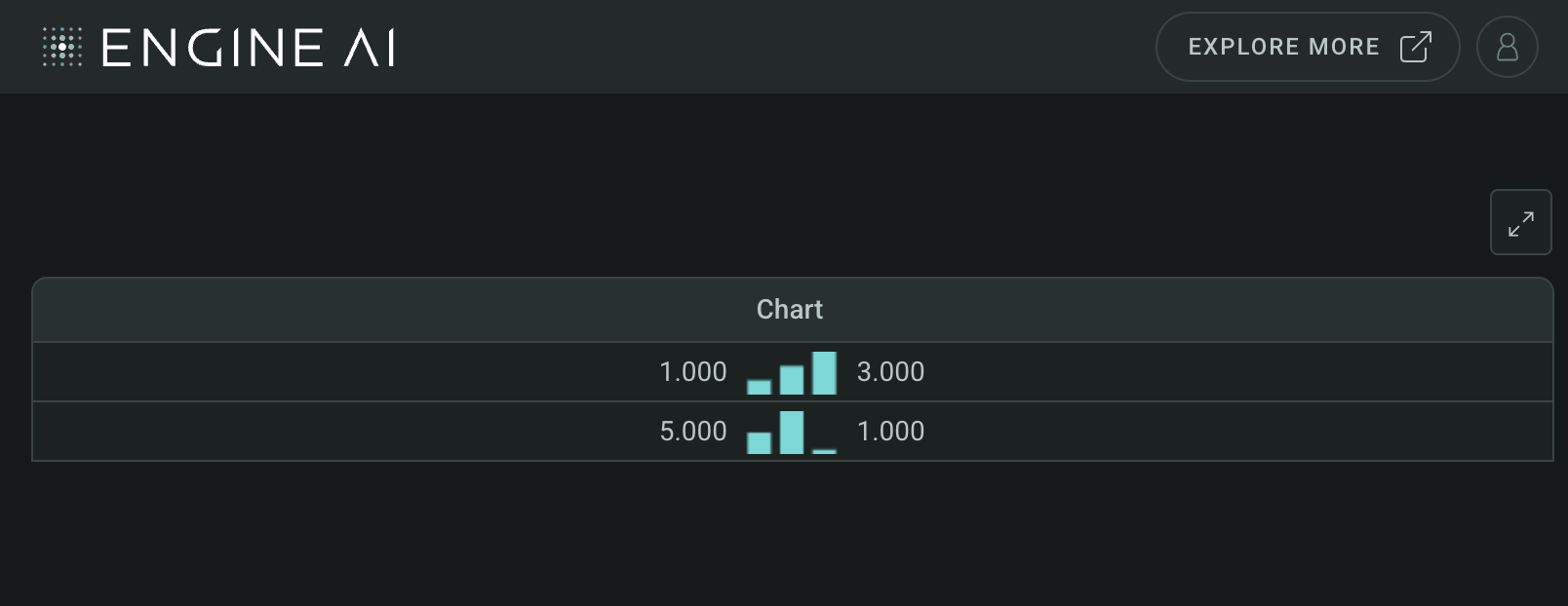
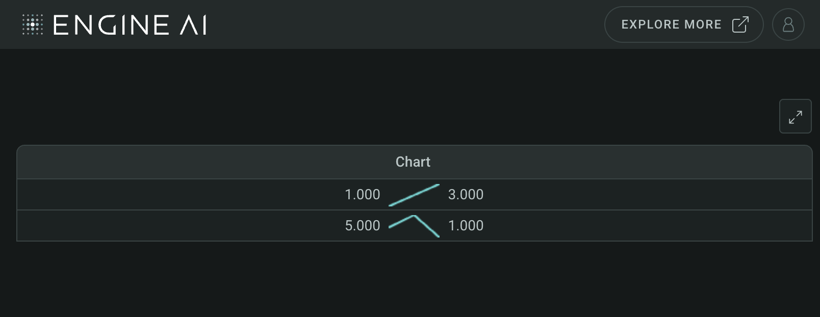
data = pd.DataFrame(
{
"chart": [{"value": [1, 2, 3]}, {"value": [5, 10, 1]}],
},
)
table_widget = table.Table(
data=data,
columns=[
table.AreaChartColumn(
data_column="chart",
data_key="value",
),
],
)
Dashboard(
workspace_slug="my-workspace",
app_slug="my-app",
slug="first-dashboard",
content=table_widget,
)
CategoryColumn #
CategoryColumn(
    *,
    data_column: str | WidgetField,
    label: str | GenericLink | None = None,
    formatting: MapperFormatting,
    styling: Palette | CategoryColumnStyling | None = None,
    align: HorizontalAlignment = LEFT,
    hiding_priority: int = 0,
    tooltip_text: list[TemplatedStringItem] | None = None,
    min_width: int | None = None,
    sortable: bool = False,
    optional: bool = False,
)
Define table widget column: Categorize data with source.
Define a column in the table widget that categorizes data, with options for data source, label, formatting, styling, and alignment.
Constructor for CategoryColumn.
Parameters:
| Name | Type | Description | Default |
|---|---|---|---|
data_column
|
str | WidgetField
|
name of column in pandas dataframe(s) used for this widget. |
required |
label
|
str | GenericLink | None
|
label to be displayed for this column. |
None
|
formatting
|
MapperFormatting
|
formatting spec. |
required |
styling
|
Palette | CategoryColumnStyling | None
|
styling spec for column. One of TableColumnStylingCell, TableColumnStylingCountryFlag or TableColumnStylingDot. |
None
|
align
|
HorizontalAlignment
|
column align. |
LEFT
|
hiding_priority
|
int
|
columns with lower hiding_priority are hidden first if not all data can be shown. |
0
|
tooltip_text
|
list[TemplatedStringItem] | None
|
info text to explain column. Each element of list is displayed as a separate paragraph. |
None
|
min_width
|
int | None
|
min width of the column in pixels. |
None
|
sortable
|
bool
|
determines if column can be sorted. |
False
|
optional
|
bool
|
flag to make the column optional if there is no Data for that columns. |
False
|
Example:#
Create a Table widget with CategoryColumn
import pandas as pd
from engineai.sdk.dashboard import formatting
from engineai.sdk.dashboard.dashboard import Dashboard
from engineai.sdk.dashboard.widgets import table
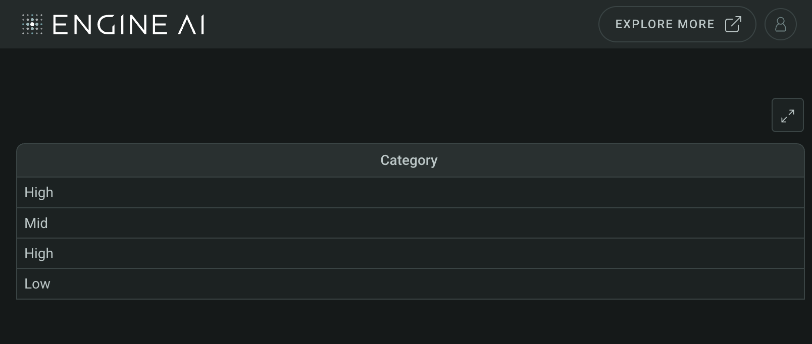
data = pd.DataFrame(
{
"category": [3, 2, 3, 1],
},
)
table_widget = table.Table(
data=data,
columns=[
table.CategoryColumn(
data_column="category",
formatting=formatting.MapperFormatting(
mapping={1: "Low", 2: "Mid", 3: "High"}
),
),
],
)
Dashboard(
workspace_slug="my-workspace",
app_slug="my-app",
slug="first-dashboard",
content=table_widget,
)
ColumnChartColumn #
ColumnChartColumn(
    *,
    data_column: str | WidgetField,
    data_key: str | WidgetField,
    label: str | GenericLink | None = None,
    formatting: NumberFormatting | None = None,
    styling: Palette | ColumnChartStyling | None = None,
    display_first_value: bool = True,
    display_last_value: bool = True,
    reference_line: ReferenceLineType | None = None,
    hiding_priority: int = 0,
    tooltip_text: list[TemplatedStringItem] | None = None,
    min_width: int | None = None,
    sortable: bool = True,
    optional: bool = False,
    tooltip: ChartTooltip | None = None,
)
Define table widget column: Column sparkline chart with data.
Define a column in the table widget that displays a column sparkline chart, including options for data, formatting, styling, and more.
Constructor for ColumnChartColumn.
Parameters:
| Name | Type | Description | Default |
|---|---|---|---|
data_column
|
str | WidgetField
|
name of column in pandas dataframe(s) used for this widget. |
required |
data_key
|
str | WidgetField
|
key in object that contains the value for the line chart. |
required |
label
|
str | GenericLink | None
|
label to be displayed for this column. |
None
|
formatting
|
NumberFormatting | None
|
formatting spec. |
None
|
styling
|
Palette | ColumnChartStyling | None
|
styling spec for column chart. |
None
|
display_first_value
|
bool
|
display first value before chart. |
True
|
display_last_value
|
bool
|
display last value after chart. |
True
|
reference_line
|
ReferenceLineType | None
|
reference line that will be added to the chart created. |
None
|
hiding_priority
|
int
|
columns with lower hiding_priority are hidden first if not all data can be shown. |
0
|
tooltip_text
|
list[TemplatedStringItem] | None
|
info text to explain column. Each element of list is displayed as a separate paragraph. |
None
|
min_width
|
int | None
|
min width of the column in pixels. |
None
|
sortable
|
bool
|
determines if column can be sorted. |
True
|
optional
|
bool
|
flag to make the column optional if there is no Data for that columns. |
False
|
tooltip
|
ChartTooltip | None
|
specs for tooltip. |
None
|
Example:#
Create a Table widget with ColumnChartColumn
import pandas as pd
from engineai.sdk.dashboard.dashboard import Dashboard
from engineai.sdk.dashboard.widgets import table

data = pd.DataFrame(
    {
        "chart": [{"value": [1, 2, 3]}, {"value": [5, 10, 1]}],
    },
)

table_widget = table.Table(
    data=data,
    columns=[
        table.ColumnChartColumn(
            data_column="chart",
            data_key="value",
        ),
    ],
)

Dashboard(
    workspace_slug="my-workspace",
    app_slug="my-app",
    slug="first-dashboard",
    content=table_widget,
)
CountryColumn #
CountryColumn(
    *,
    data_column: str | WidgetField,
    label: str | GenericLink | None = None,
    formatting: TextFormatting | None = None,
    flag_position: FlagPositions = LEFT,
    align: HorizontalAlignment = LEFT,
    hiding_priority: int = 0,
    tooltip_text: list[TemplatedStringItem] | None = None,
    min_width: int | None = None,
    sortable: bool = False,
    optional: bool = False,
)
Define table widget column: Country information with data source.
Define a column in the table widget that displays country information, including options for data source, label, formatting, and alignment.
Constructor for Country Column.
Parameters:
| Name | Type | Description | Default |
|---|---|---|---|
data_column
|
str | WidgetField
|
name of column in pandas dataframe(s) used for this widget. Data in this column should be ISO 3166-1 alpha-2 country codes. |
required |
label
|
str | GenericLink | None
|
label to be displayed for this column. |
None
|
flag_position
|
FlagPositions
|
position of country flag. |
LEFT
|
formatting
|
TextFormatting | None
|
text formatting spec. |
None
|
align
|
HorizontalAlignment
|
column alignment. |
LEFT
|
hiding_priority
|
int
|
columns with lower hiding_priority are hidden first if not all data can be shown. |
0
|
tooltip_text
|
list[TemplatedStringItem] | None
|
info text to explain column. Each element of list is displayed as a separate paragraph. |
None
|
min_width
|
int | None
|
min width of the column in pixels. |
None
|
sortable
|
bool
|
determines if column can be sorted. |
False
|
optional
|
bool
|
flag to make the column optional if there is no Data for that columns. |
False
|
Example:#
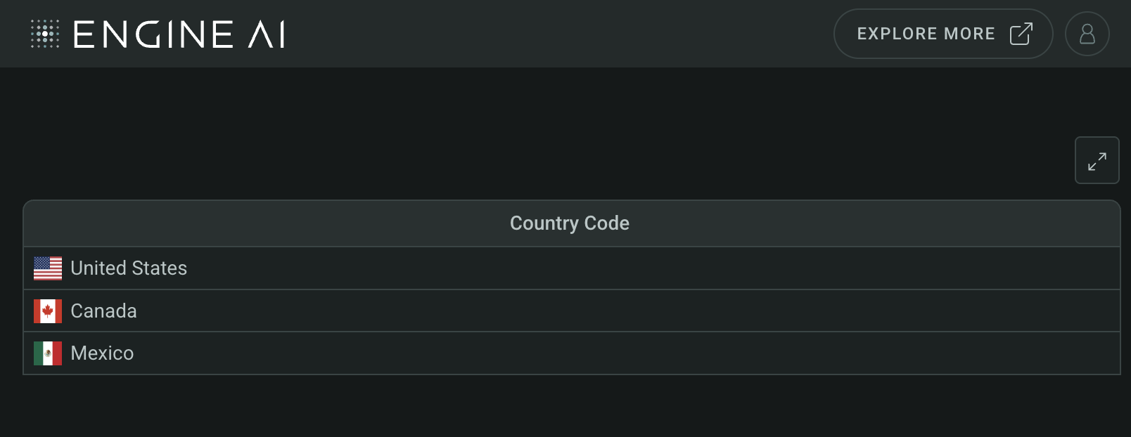
Create a Table widget with CountryColumn
import pandas as pd
from engineai.sdk.dashboard.dashboard import Dashboard
from engineai.sdk.dashboard.widgets import table

data = pd.DataFrame(
    {
        "country_code": ["US", "CA", "MX"],
    },
)

table_widget = table.Table(
    data=data,
    columns=[
        table.CountryColumn(
            data_column="country_code",
        ),
    ],
)

Dashboard(
    workspace_slug="my-workspace",
    app_slug="my-app",
    slug="first-dashboard",
    content=table_widget,
)
FlagPositions #
Country Column Flag Position Options.
Attributes:
| Name | Type | Description |
|---|---|---|
LEFT |
Flag at the left of the country name. |
|
RIGHT |
Flag at the right of the country name. |
|
HIDDEN |
Flag is hidden. |
DatetimeColumn #
DatetimeColumn(
    *,
    data_column: str | WidgetField,
    label: str | GenericLink | None = None,
    formatting: DateTimeFormatting | None = None,
    styling: Palette | DatetimeColumnStyling | None = None,
    align: HorizontalAlignment = CENTER,
    hiding_priority: int = 0,
    tooltip_text: list[TemplatedStringItem] | None = None,
    min_width: int | None = None,
    sortable: bool = True,
    optional: bool = False,
)
Define table widget column: Datetime information with data source.
Define a column in the table widget that displays datetime information, including options for data source, label, formatting, and alignment.
Constructor for DatetimeColumn.
Parameters:
| Name | Type | Description | Default |
|---|---|---|---|
data_column
|
str | WidgetField
|
name of column in pandas dataframe(s) used for this widget. |
required |
label
|
str | GenericLink | None
|
label to be displayed for this column. |
None
|
formatting
|
DateTimeFormatting | None
|
formatting spec. |
None
|
styling
|
Palette | DatetimeColumnStyling | None
|
styling spec for column. One of TableColumnStylingCell, TableColumnStylingCountryFlag or TableColumnStylingDot. |
None
|
align
|
HorizontalAlignment
|
horizontal alignment of the column. |
CENTER
|
hiding_priority
|
int
|
columns with lower hiding_priority are hidden first if not all data can be shown. |
0
|
tooltip_text
|
list[TemplatedStringItem] | None
|
info text to explain column. Each element of list is displayed as a separate paragraph. |
None
|
min_width
|
int | None
|
min width of the column in pixels. |
None
|
sortable
|
bool
|
determines if column can be sorted. |
True
|
optional
|
bool
|
flag to make the column optional if there is no Data for that columns. |
False
|
Example:#
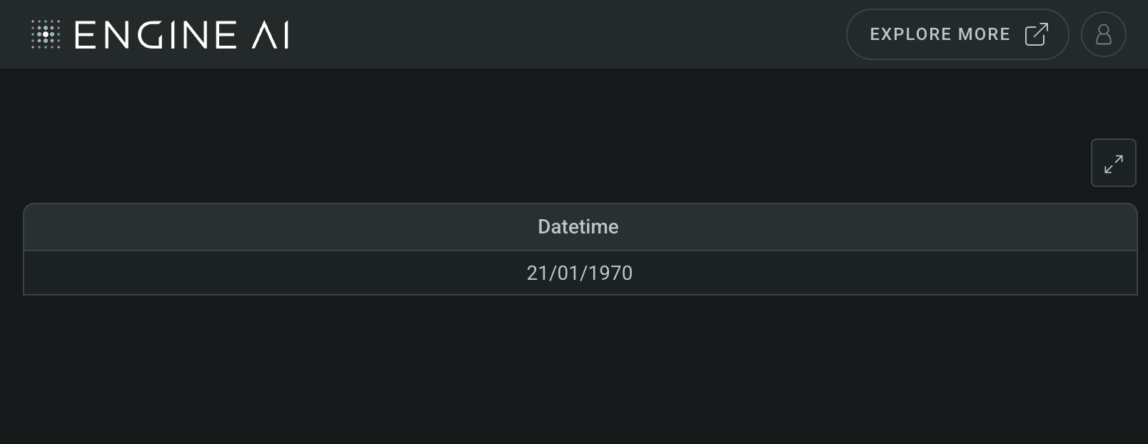
Create a Table widget with DatetimeColumn
import datetime

import pandas as pd
from engineai.sdk.dashboard.dashboard import Dashboard
from engineai.sdk.dashboard.widgets import table

data = pd.DataFrame(
    {
        "datetime": [datetime.datetime.now().timestamp()],
    },
)

table_widget = table.Table(
    data=data,
    columns=[
        table.DatetimeColumn(
            data_column="datetime",
        ),
    ],
)

Dashboard(
    workspace_slug="my-workspace",
    app_slug="my-app",
    slug="first-dashboard",
    content=table_widget,
)
LineChartColumn #
LineChartColumn(
    *,
    data_column: str | WidgetField,
    data_key: str | WidgetField,
    label: str | GenericLink | None = None,
    formatting: NumberFormatting | None = None,
    styling: Palette | LineChartStyling | None = None,
    display_first_value: bool = True,
    display_last_value: bool = True,
    reference_line: ReferenceLineType | None = None,
    hiding_priority: int = 0,
    tooltip_text: list[TemplatedStringItem] | None = None,
    min_width: int | None = None,
    sortable: bool = True,
    optional: bool = False,
    tooltip: ChartTooltip | None = None,
)
Define table widget column: Line sparkline chart with data.
Define a column in the table widget that displays a line sparkline chart, including options for data, formatting, styling, and more.
Constructor for LineChartColumn.
Parameters:
| Name | Type | Description | Default |
|---|---|---|---|
data_column
|
str | WidgetField
|
name of column in pandas dataframe(s) used for this widget. |
required |
data_key
|
str | WidgetField
|
key in object that contains the value for the line chart. |
required |
label
|
str | GenericLink | None
|
label to be displayed for this column. |
None
|
formatting
|
NumberFormatting | None
|
formatting spec. |
None
|
styling
|
Palette | LineChartStyling | None
|
styling spec for line chart. |
None
|
display_first_value
|
bool
|
display first value before chart. |
True
|
display_last_value
|
bool
|
display last value after chart. |
True
|
reference_line
|
ReferenceLineType | None
|
reference line that will be added to the chart created. |
None
|
hiding_priority
|
int
|
columns with lower hiding_priority are hidden first if not all data can be shown. |
0
|
tooltip_text
|
list[TemplatedStringItem] | None
|
info text to explain column. Each element of list is displayed as a separate paragraph. |
None
|
min_width
|
int | None
|
min width of the column in pixels. |
None
|
sortable
|
bool
|
determines if column can be sorted. |
True
|
optional
|
bool
|
flag to make the column optional if there is no Data for that columns. |
False
|
tooltip
|
ChartTooltip | None
|
specs for tooltip. |
None
|
Example:#
Create a Table widget with LineChartColumn
import pandas as pd
from engineai.sdk.dashboard.dashboard import Dashboard
from engineai.sdk.dashboard.widgets import table

data = pd.DataFrame(
    {
        "chart": [{"value": [1, 2, 3]}, {"value": [5, 10, 1]}],
    },
)

table_widget = table.Table(
    data=data,
    columns=[
        table.LineChartColumn(
            data_column="chart",
            data_key="value",
        ),
    ],
)

Dashboard(
    workspace_slug="my-workspace",
    app_slug="my-app",
    slug="first-dashboard",
    content=table_widget,
)
NumberColumn #
NumberColumn(
    *,
    data_column: str | WidgetField,
    label: str | GenericLink | None = None,
    formatting: NumberFormatting | None = None,
    styling: Palette | NumberColumnStyling | None = None,
    align: HorizontalAlignment | None = None,
    hiding_priority: int = 0,
    tooltip_text: list[TemplatedStringItem] | None = None,
    min_width: int | None = None,
    sortable: bool = True,
    optional: bool = False,
)
Define table widget column: Numerical data with data source.
Define a column in the table widget that displays numerical data, including options for data source, label, formatting, and alignment.
Constructor for NumberColumn.
Parameters:
| Name | Type | Description | Default |
|---|---|---|---|
data_column
|
str | WidgetField
|
name of column in pandas dataframe(s) used for this widget. |
required |
label
|
str | GenericLink | None
|
label to be displayed for this column. |
None
|
formatting
|
NumberFormatting | None
|
formatting spec. |
None
|
styling
|
Palette | NumberColumnStyling | None
|
styling spec for column. One of TableColumnStylingCell, TableColumnStylingCountryFlag or TableColumnStylingDot. |
None
|
align
|
HorizontalAlignment | None
|
column align. By default, it is set to the Right and when using Cell or Bar styling, otherwise it is set to the center. |
None
|
hiding_priority
|
int
|
columns with lower hiding_priority are hidden first if not all data can be shown. |
0
|
tooltip_text
|
list[TemplatedStringItem] | None
|
info text to explain column. Each element of list is displayed as a separate paragraph. |
None
|
min_width
|
int | None
|
min width of the column in pixels. |
None
|
sortable
|
bool
|
determines if column can be sorted. |
True
|
optional
|
bool
|
flag to make the column optional if there is no Data for that columns. |
False
|
Example:#
Create a Table widget with NumberColumn
import pandas as pd
from engineai.sdk.dashboard.dashboard import Dashboard
from engineai.sdk.dashboard.widgets import table
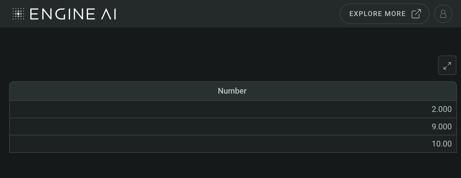
data = pd.DataFrame(
{
"number": [2, 9, 10],
},
)
table_widget = table.Table(
data=data,
columns=[
table.NumberColumn(
data_column="number",
),
],
)
Dashboard(
workspace_slug="my-workspace",
app_slug="my-app",
slug="first-dashboard",
content=table_widget,
)
RangeColumn #
RangeColumn(
    *,
    data_column: str | WidgetField,
    label: str | GenericLink | None = None,
    formatting: NumberFormatting | None = None,
    styling: Palette | RangeStyling | None = None,
    hiding_priority: int = 0,
    tooltip_text: list[TemplatedStringItem] | None = None,
    min_width: int | None = None,
    sortable: bool = True,
    optional: bool = False,
)
Define table widget column: Range values with data source.
Define a column in the table widget that represents a range of values, including options for data source, label, formatting, and styling.
Constructor for RangeColumn.
Parameters:
| Name | Type | Description | Default |
|---|---|---|---|
data_column
|
str | WidgetField
|
name of column in pandas dataframe(s) used for this widget. |
required |
label
|
str | GenericLink | None
|
label to be displayed for this column. |
None
|
formatting
|
NumberFormatting | None
|
formatting spec. |
None
|
styling
|
Palette | RangeStyling | None
|
styling spec for range. |
None
|
hiding_priority
|
int
|
columns with lower hiding_priority are hidden first if not all data can be shown. |
0
|
tooltip_text
|
list[TemplatedStringItem] | None
|
info text to explain column. Each element of list is displayed as a separate paragraph. |
None
|
min_width
|
int | None
|
min width of the column in pixels. |
None
|
sortable
|
bool
|
determines if column can be sorted. |
True
|
optional
|
bool
|
flag to make the column optional if there is no Data for that columns. |
False
|
Example:#
Create a Table widget with RangeColumn
import pandas as pd
from engineai.sdk.dashboard.dashboard import Dashboard
from engineai.sdk.dashboard.widgets import table
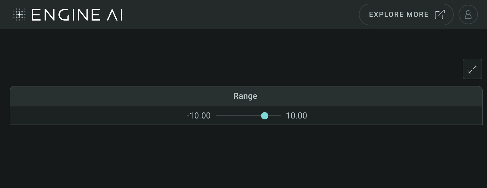
data = pd.DataFrame(
{
"range": [
{
"min": -10,
"value": 4,
"max": 10,
}
],
},
)
table_widget = table.Table(
data=data,
columns=[
table.RangeColumn(
data_column="range",
),
],
)
Dashboard(
workspace_slug="my-workspace",
app_slug="my-app",
slug="first-dashboard",
content=table_widget,
)
StackedBarColumn #
StackedBarColumn(
    *,
    data_column: str | WidgetField,
    data_key: str | WidgetField,
    label: str | GenericLink | None = None,
    bar_label_key: str | GenericLink | None = None,
    styling: StackedBarStyling | None = None,
    formatting: NumberFormatting | None = None,
    hiding_priority: int = 0,
    tooltip_text: list[TemplatedStringItem] | None = None,
    min_width: int | None = None,
    sortable: bool = True,
    display_total_value: bool = True,
    optional: bool = False,
    tooltip: StackedBarTooltip | None = None,
)
Define table widget column: Stacked bar chart with data.
Define a column in the table widget that displays a stacked bar chart, including options for data, formatting, styling, and more.
Constructor for StackedBarColumn.
Parameters:
| Name | Type | Description | Default |
|---|---|---|---|
data_column
|
str | WidgetField
|
name of column in pandas dataframe(s) used for this widget. |
required |
data_key
|
str | WidgetField
|
key in object that contains the value for the stack bar chart. |
required |
label
|
str | GenericLink | None
|
label to be displayed for this column. |
None
|
bar_label_key
|
str | GenericLink | None
|
key in object that contains the label for the bars. |
None
|
formatting
|
NumberFormatting | None
|
formatting spec. |
None
|
styling
|
StackedBarStyling | None
|
styling spec for stacked chart. |
None
|
hiding_priority
|
int
|
columns with lower hiding_priority are hidden first if not all data can be shown. |
0
|
tooltip_text
|
list[TemplatedStringItem] | None
|
info text to explain column. Each element of list is displayed as a separate paragraph. It will show up as an info icon. |
None
|
min_width
|
int | None
|
min width of the column in pixels. |
None
|
sortable
|
bool
|
determines if column can be sorted. |
True
|
display_total_value
|
bool
|
display total value after stacked bars chart. |
True
|
optional
|
bool
|
flag to make the column optional if there is no Data for that columns. |
False
|
tooltip
|
StackedBarTooltip | None
|
tooltip spec within the stacked bar chart. It will show up once the user hovers over the chart. |
None
|
Example:#
Create a Table widget with StackedBarColumn
import pandas as pd
from engineai.sdk.dashboard.dashboard import Dashboard
from engineai.sdk.dashboard.styling import color
from engineai.sdk.dashboard.widgets import table
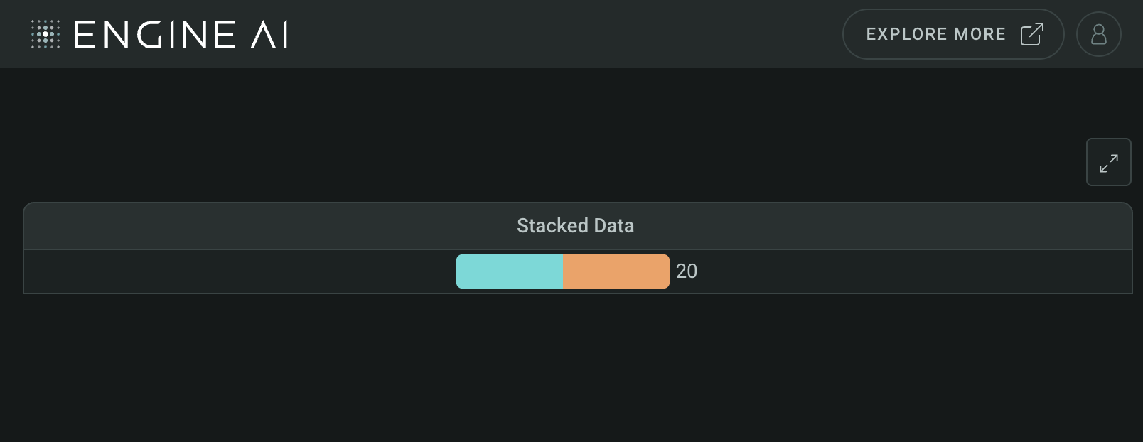
data = pd.DataFrame(
[
{
"stacked_data": [
{"key": 10, "category": 1},
{"key": 10, "category": 2},
],
}
],
)
color_spec = color.DiscreteMap(
color.DiscreteMapValueItem(value=1, color=color.Palette.MINT_GREEN),
color.DiscreteMapValueItem(value=2, color=color.Palette.SUNSET_ORANGE),
)
table_widget = table.Table(
data=data,
columns=[
table.StackedBarColumn(
data_column="stacked_data",
data_key="key",
styling=table.StackedBarStyling(
data_column="category",
color_spec=color_spec,
),
)
],
)
Dashboard(
workspace_slug="my-workspace",
app_slug="my-app",
slug="first-dashboard",
content=table_widget,
)
TextColumn #
TextColumn(
    *,
    data_column: str | WidgetField,
    label: str | GenericLink | None = None,
    formatting: TextFormatting | None = None,
    styling: Palette | TextColumnStyling | None = None,
    align: HorizontalAlignment = LEFT,
    hiding_priority: int = 0,
    tooltip_text: list[TemplatedStringItem] | None = None,
    min_width: int | None = None,
    sortable: bool = True,
    optional: bool = False,
)
Define table widget column: Text data with data source.
Define a column in the table widget that displays text data, including options for data source, label, formatting, styling, and alignment.
Constructor for TextColumn.
Parameters:
| Name | Type | Description | Default |
|---|---|---|---|
data_column
|
str | WidgetField
|
name of column in pandas dataframe(s) used for this widget. |
required |
label
|
str | GenericLink | None
|
label to be displayed for this column. |
None
|
formatting
|
TextFormatting | None
|
formatting spec. |
None
|
styling
|
Palette | TextColumnStyling | None
|
styling spec for column. One of CellStyling, CountryFlagStyling DotStyling, FontStyling or IconStyling. |
None
|
align
|
HorizontalAlignment
|
align text. |
LEFT
|
hiding_priority
|
int
|
columns with lower hiding_priority are hidden first if not all data can be shown. |
0
|
tooltip_text
|
list[TemplatedStringItem] | None
|
info text to explain column. Each element of list is displayed as a separate paragraph. |
None
|
min_width
|
int | None
|
min width of the column in pixels. |
None
|
sortable
|
bool
|
determines if column can be sorted. |
True
|
optional
|
bool
|
flag to make the column optional if there is no Data for that columns. |
False
|
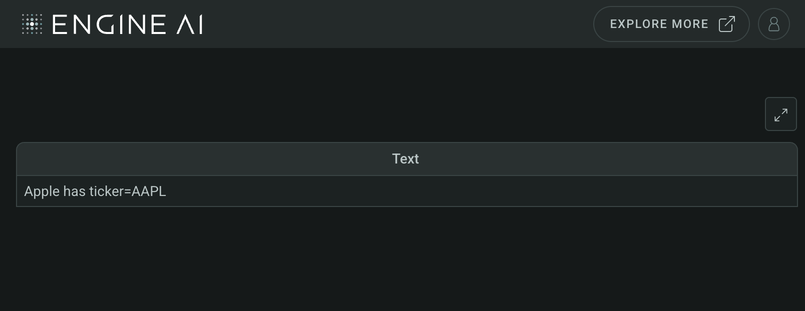
Example:#
Create a Table widget with TextColumn
import pandas as pd
from engineai.sdk.dashboard.dashboard import Dashboard
from engineai.sdk.dashboard.widgets import table

data = pd.DataFrame(
    [
        {
            "text": "Apple has ticker=AAPL",
        }
    ]
)

table_widget = table.Table(
    data=data,
    columns=[
        table.TextColumn(
            data_column="text",
        ),
    ],
)

Dashboard(
    workspace_slug="my-workspace",
    app_slug="my-app",
    slug="first-dashboard",
    content=table_widget,
)
EventColumn #
EventColumn(
    *,
    action: Actions,
    label: str | WidgetField | None = None,
    hiding_priority: int = 0,
    tooltip_text: list[TemplatedStringItem] | None = None,
    min_width: int | None = None,
)
Specifications for EventColumn class.
Class EventColumn is used as urlx column for the Table Widget.
Parameters:
| Name | Type | Description | Default |
|---|---|---|---|
action
|
Actions
|
action to be triggered on click. |
required |
label
|
str | WidgetField | None
|
label to be displayed for this column. |
None
|
hiding_priority
|
int
|
columns with lower hiding_priority are hidden first if not all data can be shown. |
0
|
tooltip_text
|
list[TemplatedStringItem] | None
|
info text to explain column. Each element of list is displayed as a separate paragraph. |
None
|
min_width
|
int | None
|
min width of the column in pixels. |
None
|
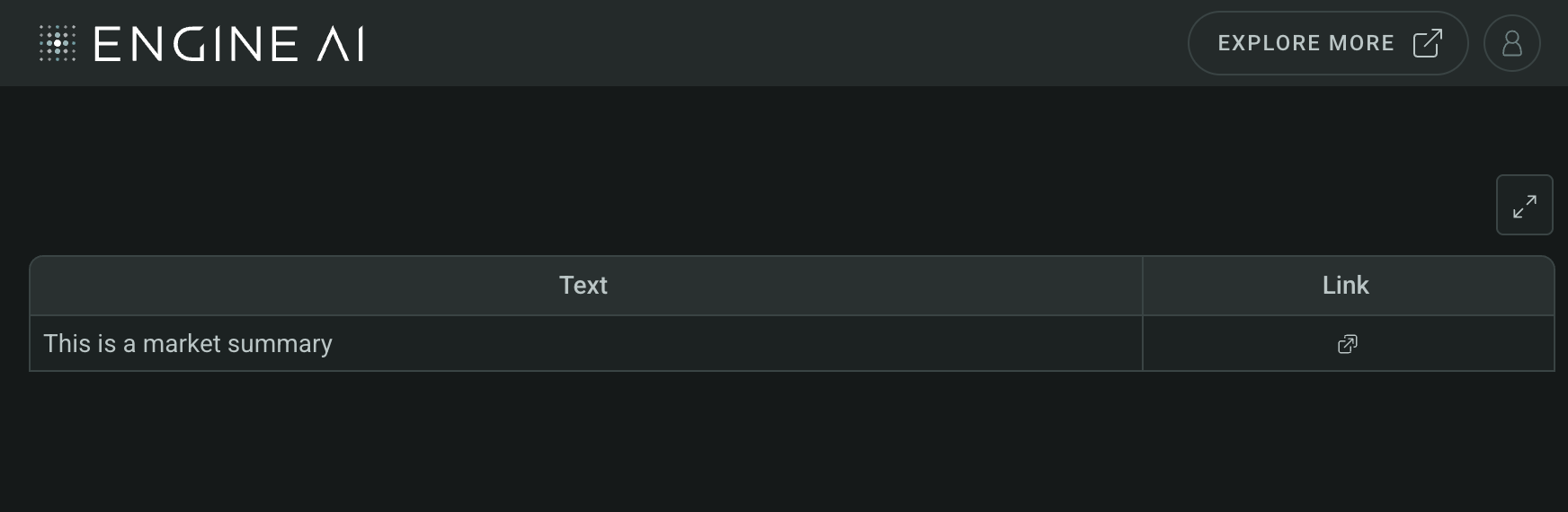
Example:#
Create a Table widget with EventColumn
import pandas as pd

from engineai.sdk.dashboard.dashboard import Dashboard
from engineai.sdk.dashboard.widgets import table

data = pd.DataFrame(
    [
        {
            "link": "https://engineai.com",
            "text": "This is a market summary",
        }
    ]
)

table_widget = table.Table(
    data=data,
    columns=[
        "text",
        table.EventColumn(
            action=table.UrlLink(
                data_column="link",
                tooltip="Click to open market summary",
            )
        ),
    ],
)

Dashboard(
    workspace_slug="my-workspace",
    app_slug="my-app",
    slug="first-dashboard",
    content=table_widget,
)
Columns Styling#
CellStyling #
CellStyling(
    *,
    color_spec: ColorSpec,
    data_column: str | WidgetField | None = None,
    percentage_fill: int | float | None = 1,
)
Styling options for table widget cell.
Specify the styling options for a cell in the table widget, including color, data column, and percentage fill.
Constructor for CellStyling.
Parameters:
| Name | Type | Description | Default |
|---|---|---|---|
data_column
|
str | WidgetField | None
|
id of column which values are used to determine behavior of arrow. By default, will use values of column to which styling is applied. |
None
|
percentage_fill
|
int | float | None
|
how much of the cell should the color fill. Default to 1, meaning the whole cell |
1
|
color_spec
|
ColorSpec
|
spec for color of arrows. |
required |
CountryFlagStyling #
CountryFlagStyling(
    *,
    left: bool = True,
    data_column: str | WidgetField | None = None,
)
Styling options for country flag column.
Specify the styling options for a country flag column in the table widget, including position and data column.
Constructor for CountryFlagStyling.
Parameters:
| Name | Type | Description | Default |
|---|---|---|---|
data_column
|
str | WidgetField | None
|
id of column which values are used to determine behavior of arrow. By default, will use values of column to which styling is applied. |
None
|
left
|
bool
|
whether to put flag to the left (True) or right (False) of column value. |
True
|
DotStyling #
DotStyling(
    *,
    color_spec: ColorSpec | None = None,
    data_column: str | WidgetField | None = None,
)
Styling options for dot column.
Specify the styling options for a dot column in the table widget, including color and data column.
Constructor for DotStyling.
Parameters:
| Name | Type | Description | Default |
|---|---|---|---|
data_column
|
str | WidgetField | None
|
id of column which values are used to determine behavior of color of dot. Optional if color_spec is a single color. |
None
|
color_spec
|
ColorSpec | None
|
spec for color of dot. |
None
|
FontStyling #
FontStyling(
    *,
    color_spec: ColorSpec,
    data_column: str | WidgetField | None = None,
    highlight_background: bool = False,
)
Font styling options.
Specify the font styling options for a column in the table widget, including color, data column, and background highlighting.
Constructor for FontStyling.
Parameters:
| Name | Type | Description | Default |
|---|---|---|---|
data_column
|
str | WidgetField | None
|
id of column which values are used to determine behavior of color of dot. Optional if color_spec is a single color. |
None
|
color_spec
|
ColorSpec
|
spec for color of dot. |
required |
highlight_background
|
bool
|
Highlight value background. |
False
|
IconStyling #
IconStyling(
    *,
    data_column: str | WidgetField | None,
    left: bool = True,
)
Styling options for icon column.
Specify the styling options for an icon column in the table widget, including data column and position.
Constructor for IconStyling.
Parameters:
| Name | Type | Description | Default |
|---|---|---|---|
data_column
|
str | WidgetField | None
|
id of column which values are used to determine behavior of arrow. By default, will use values of column to which styling is applied. |
required |
left
|
bool
|
whether to put icon to the left (True) or right (False) of column value. |
True
|
ArrowStyling #
ArrowStyling(
    *,
    data_column: str | WidgetField | None = None,
    mid: int | float = 0,
    color_spec: ColorSpec | None = None,
)
Styling options for arrow column.
Specify the styling options for an arrow column in the table widget, including data column, mid value, and color.
Constructor for ArrowStyling.
Parameters:
| Name | Type | Description | Default |
|---|---|---|---|
data_column
|
str | WidgetField | None
|
id of column which values are used to determine behavior of arrow. By default, will use values of column to which styling is applied. |
None
|
mid
|
int | float
|
value that determines when arrow flips up/down. |
0
|
color_spec
|
ColorSpec | None
|
spec for color of arrows. By default, used the PositiveNegativeDiscreteMap. |
None
|
ColorBarStyling #
ColorBarStyling(
    *,
    color_spec: ColorSpec,
    data_column: str | WidgetField | None = None,
    left_to_right: bool = True,
    min_value: int | float | None = None,
    max_value: int | float | None = None,
    percentage_fill: float = 0.9,
)
Styling options for split color bar column.
Specify the styling options for a color bar column in the table widget, including color, data column, direction, min/max values, and percentage fill.
Constructor for ColorBarStyling.
Parameters:
| Name | Type | Description | Default |
|---|---|---|---|
color_spec
|
ColorSpec
|
spec for bar color. |
required |
data_column
|
str | WidgetField | None
|
id of column which values are used to determine behavior of arrow. By default, will use values of column to which styling is applied. |
None
|
left_to_right
|
bool
|
determines the direction of color bar. |
True
|
min_value
|
int | float | None
|
value that determines a 0% bar. By default, takes the minimum value in the data. |
None
|
max_value
|
int | float | None
|
value that determines a full bar. By default, takes the maximum value in the data. |
None
|
percentage_fill
|
float
|
how much of the cell should the color fill. |
0.9
|
SplitBarStyling #
SplitBarStyling(
    *,
    data_column: str | WidgetField | None = None,
    color_spec: ColorSpec | None = None,
    min_value: int | float | None = None,
    max_value: int | float | None = None,
    percentage_fill: float = 0.9,
)
Styling options for split color bar column.
Specify the styling options for a split color bar column in the table widget, including color, data column, min/max values, and percentage fill.
Constructor for SplitBarStyling.
Parameters:
| Name | Type | Description | Default |
|---|---|---|---|
data_column
|
str | WidgetField | None
|
id of column which values are used to determine behavior of arrow. By default, will use values of column to which styling is applied. |
None
|
color_spec
|
ColorSpec | None
|
spec for color class. |
None
|
min_value
|
int | float | None
|
value that determines a 0% bar. By default, takes the minimum value in the data. |
None
|
max_value
|
int | float | None
|
value that determines a full bar. By default, takes the maximum value in the data. |
None
|
percentage_fill
|
float
|
how much of the cell should the color fill. |
0.9
|
AreaChartStyling #
AreaChartStyling(
    *,
    color_spec: ColorSpec,
    data_key: str | WidgetField | None = None,
)
Styling options for area chart column.
Specify the styling options for an area chart column in the table widget, including color and data key.
Constructor for AreaChartStyling.
Parameters:
| Name | Type | Description | Default |
|---|---|---|---|
data_key
|
str | WidgetField | None
|
Dictionary key, stored in data, that is used for chart. By default, will use values of column to which styling is applied. |
None
|
color_spec
|
ColorSpec
|
spec for color of area chart. |
required |
ColumnChartStyling #
ColumnChartStyling(
    *,
    color_spec: ColorSpec,
    data_key: str | WidgetField | None = None,
)
Styling options for column chart column.
Specify the styling options for a column chart column in the table widget, including color and data key.
Constructor for ColumnChartStyling.
Parameters:
| Name | Type | Description | Default |
|---|---|---|---|
data_key
|
str | WidgetField | None
|
Dictionary key, stored in data, that is used for chart. By default, will use values of column to which styling is applied. |
None
|
color_spec
|
ColorSpec
|
spec for color of column chart. |
required |
LineChartStyling #
LineChartStyling(
    *,
    color_spec: ColorSpec,
    data_key: str | WidgetField | None = None,
)
Styling options for line chart column.
Specify the styling options for a line chart column in the table widget, including color and data key.
Constructor for LineChartStyling.
Parameters:
| Name | Type | Description | Default |
|---|---|---|---|
data_key
|
str | WidgetField | None
|
Dictionary key, stored in data, that is used for chart. By default, will use values of column to which styling is applied. |
None
|
color_spec
|
ColorSpec
|
spec for color of line chart. |
required |
RangeStyling #
RangeStyling(
    *,
    color_spec: ColorSpec,
    data_column: str | WidgetField | None = None,
    shape: RangeShape = CIRCLE,
)
Styling options for range column.
Specify the styling options for a range column in the table widget, including color, data column, and shape.
Constructor for RangeStyling.
Parameters:
| Name | Type | Description | Default |
|---|---|---|---|
data_column
|
str | WidgetField | None
|
id of column which values are used to determine behavior of arrow. |
None
|
color_spec
|
ColorSpec
|
spec for color of range value. |
required |
shape
|
RangeShape
|
shape of range indicator. |
CIRCLE
|
StackedBarStyling #
StackedBarStyling(
    *,
    color_spec: DiscreteMap,
    data_column: str | WidgetField | None = None,
)
Styling options for stacked bar column.
Specify the styling options for a stacked bar column in the table widget, including color, data column, and total display.
Constructor for StackedBarStyling.
Parameters:
| Name | Type | Description | Default |
|---|---|---|---|
data_column
|
str | WidgetField | None
|
id of column which values are used for chart. |
None
|
color_spec
|
DiscreteMap
|
spec for discrete color map of stacked bar column chart. |
required |
Types#
TableColumns
module-attribute
#
TextColumnStyling
module-attribute
#
TextColumnStyling = (
    CellStyling
    | CountryFlagStyling
    | DotStyling
    | FontStyling
    | IconStyling
)
NumberColumnStyling
module-attribute
#
NumberColumnStyling = (
    ArrowStyling
    | CellStyling
    | ColorBarStyling
    | CountryFlagStyling
    | DotStyling
    | FontStyling
    | SplitBarStyling
)