Timeseries#
Timeseries #
Timeseries(
    data: DataType | DataFrame,
    *,
    charts: list[str | TimeseriesSeries | Chart]
    | None = None,
    date_column: TemplatedStringItem | None = None,
    widget_id: str | None = None,
    period_selector: PeriodSelector | None = None,
    title: WidgetTitleType | None = None,
    legend: LegendPosition | None = None,
    navigator: Navigator | TimeseriesSeries | None = None,
    enable_toolbar: bool = True,
)
Visualize charts, customize data, date, toolbar.
Visualize multiple charts with date selector, navigator, legend. Customize data source, date column, toolbar. Enable or disable toolbar for enhanced user control.
Constructor for Timeseries widget.
Parameters:
| Name | Type | Description | Default |
|---|---|---|---|
data
|
DataType | DataFrame
|
data to be used by widget. Accepts DataSource method as well as raw data. |
required |
charts
|
list[str | TimeseriesSeries | Chart] | None
|
list of charts to be added to the widget. Each element in the list is a new chart, with a maximum of 5 Charts. |
None
|
date_column
|
TemplatedStringItem | None
|
column that must be used as x axis date. This column must be of type datetime. |
None
|
widget_id
|
str | None
|
unique widget id in a dashboard. |
None
|
period_selector
|
PeriodSelector | None
|
selector for particular periods in a chart. |
None
|
title
|
WidgetTitleType | None
|
title of widget can be either a string (fixed value) or determined by a value from another widget using a WidgetLink. |
None
|
legend
|
LegendPosition | None
|
legend of timeseries widget. |
None
|
navigator
|
Navigator | TimeseriesSeries | None
|
navigator added to the bottom of all charts to facilitate navigation. |
None
|
enable_toolbar
|
bool
|
Enable/Disable toolbar flag. |
True
|
Examples:#
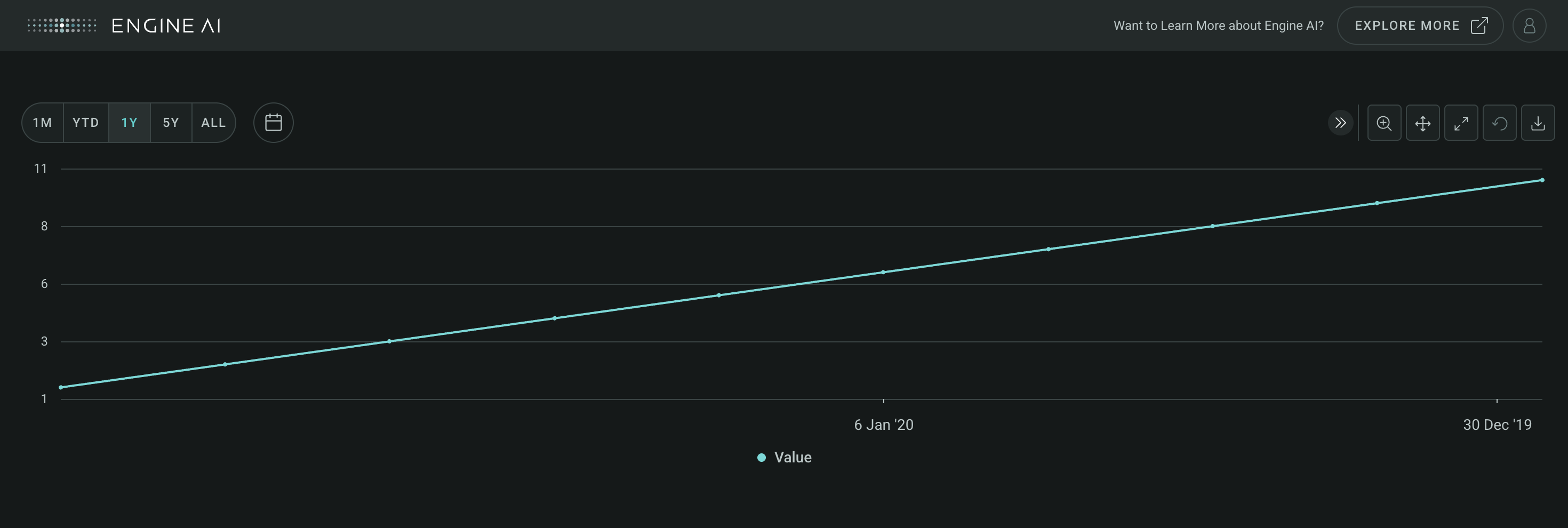
Create a minimal Timeseries Widget
import pandas as pd
from engineai.sdk.dashboard.dashboard import Dashboard
from engineai.sdk.dashboard.widgets import timeseries

data = pd.DataFrame(
    {
        "date": pd.date_range("2020-01-01", "2020-01-10"),
        "value": [1, 2, 3, 4, 5, 6, 7, 8, 9, 10],
    }
)

timeseries_widget = timeseries.Timeseries(data=data, date_column="date")

Dashboard(
    workspace_slug="my-workspace",
    app_slug="my-app",
    slug="first-dashboard",
    content=timeseries_widget,
)
Data#
This widget works with tabular data, typically in the form of a Pandas DataFrame with a date column.
Components#
Chart #
Chart(
    *,
    left_y_axis: YAxisSpec | TimeseriesSeries | None = None,
    height_percentage: int | float | None = None,
    height: int | float = 3,
    x_axis: XAxis | None = None,
    right_y_axis: YAxisSpec
    | TimeseriesSeries
    | None = None,
    title: str | WidgetField | None = None,
    area_series_stacked: bool = False,
    tooltips: TooltipItems | None = None,
)
Customize charts in Timeseries widget.
Construct charts within a timeseries widget, offering a variety of customizable options for effective data visualization. Specify parameters such as the x-axis specification, left and right y-axis configurations, chart title, height, area series stacking, and tooltips.
Constructor for Chart.
Parameters:
| Name | Type | Description | Default |
|---|---|---|---|
x_axis
|
XAxis | None
|
spec for x axis or the specific date column that must be used for the x axis. |
None
|
left_y_axis
|
YAxisSpec | TimeseriesSeries | None
|
spec for left y axis. If |
None
|
right_y_axis
|
YAxisSpec | TimeseriesSeries | None
|
spec for right y axis (optional). If |
None
|
title
|
str | WidgetField | None
|
title of chart can be either a string (fixed value) or determined by a value from another widget using a WidgetField. |
None
|
height_percentage
|
int | float | None
|
percentage of height occupied by chart. The height_percentage of all charts in a timeseries widgets has to sum to 1. |
None
|
height
|
int | float
|
height value for the chart in units of 100px. Values range from 2 to 10 units. |
3
|
area_series_stacked
|
bool
|
enable stacking for all area series in this chart. |
False
|
tooltips
|
TooltipItems | None
|
tooltip items to be displayed at Chart level. |
None
|
Navigator #
Navigator(
    *series: TimeseriesSeries,
    title: WidgetTitleType | None = None,
)
Navigation of Timeseries data.
Construct a navigator for a timeseries widget for efficient navigation and exploration of time-series data. Specify one or more series to be included in the navigator for easy visualization of trends and patterns across different metrics.
Constructor for Navigator.
Parameters:
| Name | Type | Description | Default |
|---|---|---|---|
title
|
WidgetTitleType | None
|
title to be added to navigator |
None
|
series
|
TimeseriesSeries
|
series to be added to navigator |
()
|
Example:#
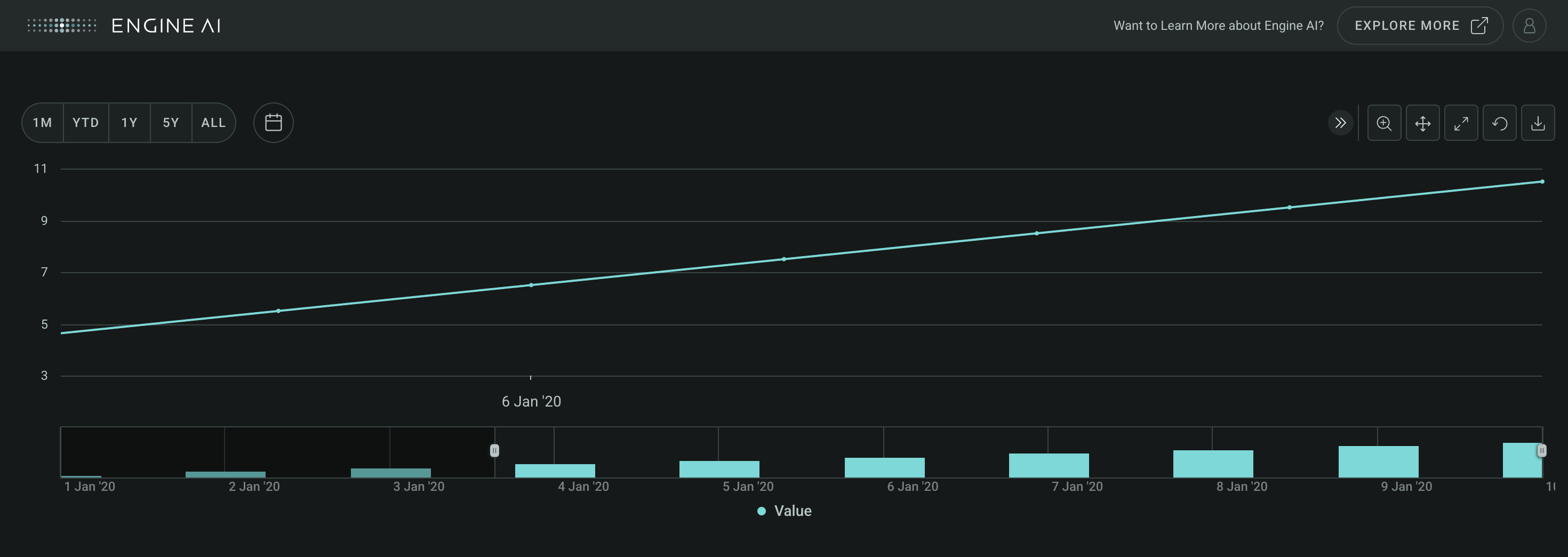
Create a minimal Timeseries Widget with a navigator
import pandas as pd
from engineai.sdk.dashboard.dashboard import Dashboard
from engineai.sdk.dashboard.widgets import timeseries

data = pd.DataFrame(
    {
        "date": pd.date_range("2020-01-01", "2020-01-10"),
        "value": [1, 2, 3, 4, 5, 6, 7, 8, 9, 10],
    }
)

timeseries_widget = timeseries.Timeseries(
    data,
    date_column="date",
    navigator=timeseries.Navigator(timeseries.ColumnSeries(data_column="value")),
)

Dashboard(
    workspace_slug="my-workspace",
    app_slug="my-app",
    slug="first-dashboard",
    content=timeseries_widget,
)
XAxis #
XAxis(
    *,
    enable_crosshair: bool = False,
    line: AxisLine | None = None,
    band: AxisBand | None = None,
)
Specify x-axis appearance & behavior in Timeseries chart.
Construct specifications for the x-axis of a Timeseries chart with a range of options to customize its appearance and behavior.
Construct TimeseriesBaseAxis.
Parameters:
| Name | Type | Description | Default |
|---|---|---|---|
enable_crosshair
|
bool
|
whether to enable crosshair that follows either the mouse pointer or the hovered point. |
False
|
line
|
AxisLine | None
|
line spec for y axis. |
None
|
band
|
AxisBand | None
|
band spec for y axis. |
None
|
YAxis #
YAxis(
    *,
    series: list[str | TimeseriesSeries] | None = None,
    formatting: AxisNumberFormatting | None = None,
    title: str | WidgetField = "",
    enable_crosshair: bool = False,
    scale: AxisScale | None = None,
    line: AxisLine | None = None,
    band: AxisBand | None = None,
)
Specify y-axis appearance & behavior in Timeseries chart.
Construct specifications for the y-axis of a Timeseries chart with a range of options to customize its appearance and behavior.
Constructor for YAxis.
Parameters:
| Name | Type | Description | Default |
|---|---|---|---|
series
|
list[str | TimeseriesSeries] | None
|
series to be added to the y axis. |
None
|
formatting
|
AxisNumberFormatting | None
|
formatting spec for axis labels. |
None
|
title
|
str | WidgetField
|
axis title. |
''
|
enable_crosshair
|
bool
|
whether to enable crosshair that follows either the mouse pointer or the hovered point. |
False
|
scale
|
AxisScale | None
|
y axis scale, one of AxisScaleSymmetric, AxisScaleDynamic, AxisScalePositive, AxisScaleNegative. |
None
|
line
|
AxisLine | None
|
line spec for y axis. |
None
|
band
|
AxisBand | None
|
band spec for y axis. |
None
|
add_series #
add_series(*series: TimeseriesSeries) -> YAxis
Add series to y axis.
Returns:
| Name | Type | Description |
|---|---|---|
YAxis |
YAxis
|
reference to this axis to facilitate inline manipulation. |
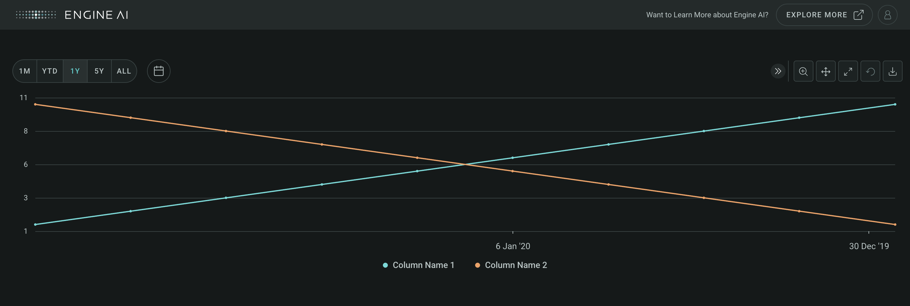
Add multiple series to a chart
import pandas as pd
from engineai.sdk.dashboard.dashboard import Dashboard
from engineai.sdk.dashboard.widgets import timeseries

data = pd.DataFrame(
    {
        "date": pd.date_range("2020-01-01", "2020-01-10"),
        "column_name_1": [1, 2, 3, 4, 5, 6, 7, 8, 9, 10],
        "column_name_2": [10, 9, 8, 7, 6, 5, 4, 3, 2, 1],
        "column_name_3": [5, 4, 3, 2, 1, 2, 3, 4, 5, 6],
    }
)

timeseries_widget = timeseries.Timeseries(
    data,
    date_column="date",
    charts=[
        timeseries.Chart(
            left_y_axis=timeseries.YAxis(
                series=[
                    "column_name_1",
                    "column_name_2",
                ]
            )
        ),
    ],
)

Dashboard(
    workspace_slug="my-workspace",
    app_slug="my-app",
    slug="first-dashboard",
    content=timeseries_widget,
)
MirrorYAxis #
MirrorYAxis(
    *,
    top_series: list[str | TimeseriesSeries] | None = None,
    bottom_series: list[str | TimeseriesSeries]
    | None = None,
    formatting: AxisNumberFormatting | None = None,
    title: str | WidgetField = "",
    enable_crosshair: bool = False,
    scale: AxisScale | None = None,
    line: AxisLine | None = None,
    band: AxisBand | None = None,
)
Customize appearance & behavior of mirror y-axis in Timeseries chart.
Construct specifications for the mirror y-axis of a Timeseries chart with a range of options to customize its appearance and behavior.
Constructor for MirrorYAxis.
Parameters:
| Name | Type | Description | Default |
|---|---|---|---|
top_series
|
list[str | TimeseriesSeries] | None
|
series to be added to the top y axis. |
None
|
bottom_series
|
list[str | TimeseriesSeries] | None
|
series to be added to the bottom y axis. |
None
|
formatting
|
AxisNumberFormatting | None
|
formatting spec for axis labels. |
None
|
title
|
str | WidgetField
|
axis title. |
''
|
enable_crosshair
|
bool
|
whether to enable crosshair that follows either the mouse pointer or the hovered point. |
False
|
scale
|
AxisScale | None
|
y axis scale, one of AxisScaleSymmetric, AxisScaleDynamic, AxisScalePositive, AxisScaleNegative. |
None
|
line
|
AxisLine | None
|
line spec for y axis. |
None
|
band
|
AxisBand | None
|
band spec for y axis. |
None
|
add_bottom_series #
add_bottom_series(*series: TimeseriesSeries) -> MirrorYAxis
Add series to top y axis.
Returns:
| Name | Type | Description |
|---|---|---|
MirrorYAxis |
MirrorYAxis
|
reference to this axis to facilitate inline manipulation. |
Raises:
| Type | Description |
|---|---|
TimeseriesAxisEmptyDefinitionError
|
when no series data are added |
ChartSeriesNameAlreadyExistsError
|
when series have duplicated names |
add_top_series #
add_top_series(*series: TimeseriesSeries) -> MirrorYAxis
Add series to top y axis.
Returns:
| Name | Type | Description |
|---|---|---|
MirrorYAxis |
MirrorYAxis
|
reference to this axis to facilitate inline manipulation. |
Raises:
| Type | Description |
|---|---|
TimeseriesAxisEmptyDefinitionError
|
when no series data are added |
ChartSeriesNameAlreadyExistsError
|
when series have duplicated names |
Periods#
PeriodSelector #
PeriodSelector(
    *periods: PeriodType,
    default_selection: int | None = None,
    visible: bool = True,
)
Select predefined periods for Timeseries visualization.
Construct specifications for a period selector component of a timeseries widget, select predefined periods for data visualization.
Constructor for PeriodSelector.
Parameters:
| Name | Type | Description | Default |
|---|---|---|---|
periods
|
PeriodType
|
specs for periods added into timeseries widget period selector component. |
()
|
default_selection
|
int | None
|
choose which period selector to be the default. |
None
|
visible
|
bool
|
flag that makes the period selector visible. If False, all periods added and default selection will be ignored. |
True
|
Raises:
| Type | Description |
|---|---|
TimeseriesPeriodSelectorEmptyDefinitionError
|
when |
TimeseriesPeriodSelectorNoAvailableDefaultOptionError
|
when the desired default selection element does not exist |
Example:#
Create a Timeseries widget with a period selector
import pandas as pd
from engineai.sdk.dashboard.dashboard import Dashboard
from engineai.sdk.dashboard.widgets import timeseries

data = pd.DataFrame(
    {
        "date": pd.date_range("2020-01-01", "2020-01-10"),
        "value": [1, 2, 3, 4, 5, 6, 7, 8, 9, 10],
    }
)

timeseries_widget = timeseries.Timeseries(
    data=data,
    date_column="date",
    period_selector=timeseries.PeriodSelector(
        timeseries.Period.W1,
        timeseries.Period.M1,
        timeseries.Period.ALL,
        default_selection=1,
    ),
)

Dashboard(
    workspace_slug="my-workspace",
    app_slug="my-app",
    slug="first-dashboard",
    content=timeseries_widget,
)
Period #
Standard time intervals for period selector in Timeseries.
Defines standard periods for a period selector component to choose predefined time intervals for data visualization. Each period represents a lookback relative to the last date of the chart.
Attributes:
| Name | Type | Description |
|---|---|---|
D1 |
1 day. |
|
W1 |
1 week. |
|
W2 |
2 weeks. |
|
M1 |
1 month. |
|
M3 |
3 months. |
|
M6 |
6 months. |
|
YTD |
Year to date. |
|
Y1 |
1 year. |
|
Y2 |
2 years. |
|
Y3 |
3 years. |
|
Y4 |
4 years. |
|
Y5 |
5 years. |
|
ALL |
All data. |
CustomPeriod #
Define custom time intervals for period selector in Timeseries.
Construct specifications for a custom period for a period selector component to define time intervals.
Constructor for CustomPeriod.
Parameters:
| Name | Type | Description | Default |
|---|---|---|---|
label
|
str | None
|
label to show in period selector. |
None
|
start_date
|
str | datetime
|
start date of custom period in a format supported by pandas.to_datetime. |
required |
end_date
|
str | datetime
|
end date of custom period in a format supported by pandas.to_datetime. |
required |
Raises:
| Type | Description |
|---|---|
TimeseriesPeriodSelectorDatesDefinitionError
|
if end_date <= start_date |
Series#
AreaSeries #
AreaSeries(
    *,
    data_column: str | WidgetField,
    name: str | GenericLink | None = None,
    styling: Palette | AreaSeriesStyling | None = None,
    entity: Entities | None = None,
    show_in_legend: bool = True,
    required: bool = True,
    visible: bool = True,
    right_axis: bool = False,
    tooltips: TooltipItems | None = None,
)
Visualize data as filled areas in Timeseries widget.
Construct specifications for an area series within a Timeseries widget to visualize data as filled areas on the chart.
Constructor for AreaSeries.
Parameters:
| Name | Type | Description | Default |
|---|---|---|---|
data_column
|
str | WidgetField
|
name of column in pandas dataframe(s) used for the values of this series. |
required |
name
|
str | GenericLink | None
|
series name shown in legend and tooltip. |
None
|
styling
|
Palette | AreaSeriesStyling | None
|
styling spec, by default uses the values from the sequential palette. |
None
|
entity
|
Entities | None
|
entity spec. |
None
|
show_in_legend
|
bool
|
whether to show series in legend or not. |
True
|
required
|
bool
|
Flag to make the Series mandatory. If required == True and no Data the widget will show an error. If required==False and no Data, the widget hides the Series. |
True
|
visible
|
bool
|
Flag to make the Series visible when chart is loaded. |
True
|
right_axis
|
bool
|
Flag to make the Series visible on the right axis. |
False
|
tooltips
|
TooltipItems | None
|
tooltip items to be displayed at Series level. |
None
|
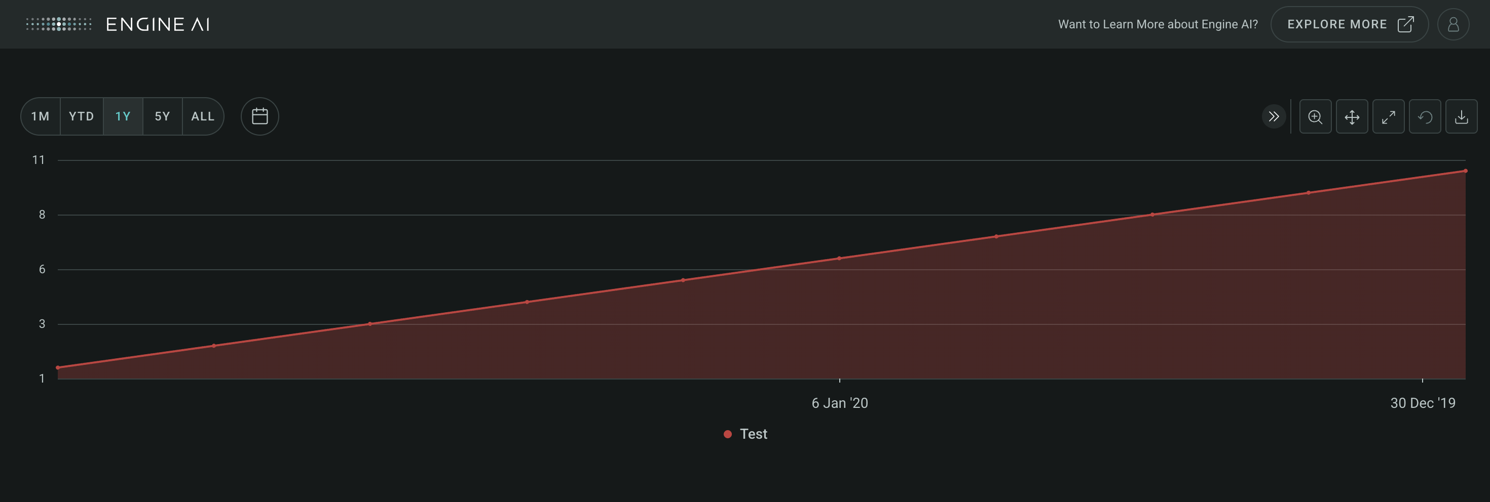
Example:#
Create a Timeseries widget with AreaSeries
import pandas as pd
from engineai.sdk.dashboard.dashboard import Dashboard
from engineai.sdk.dashboard.widgets import timeseries
from engineai.sdk.dashboard.styling import color

data = pd.DataFrame(
    {
        "date": pd.date_range("2020-01-01", "2020-01-10"),
        "value": [1, 2, 3, 4, 5, 6, 7, 8, 9, 10],
    }
)

timeseries_widget = timeseries.Timeseries(
    data,
    date_column="date",
    charts=[
        timeseries.AreaSeries(
            name="Test",
            data_column="value",
            styling=timeseries.AreaSeriesStyling(
                color_spec=color.Single(color=color.Palette.RUBI_RED)
            ),
        )
    ],
)

Dashboard(
    workspace_slug="my-workspace",
    app_slug="my-app",
    slug="first-dashboard",
    content=timeseries_widget,
)
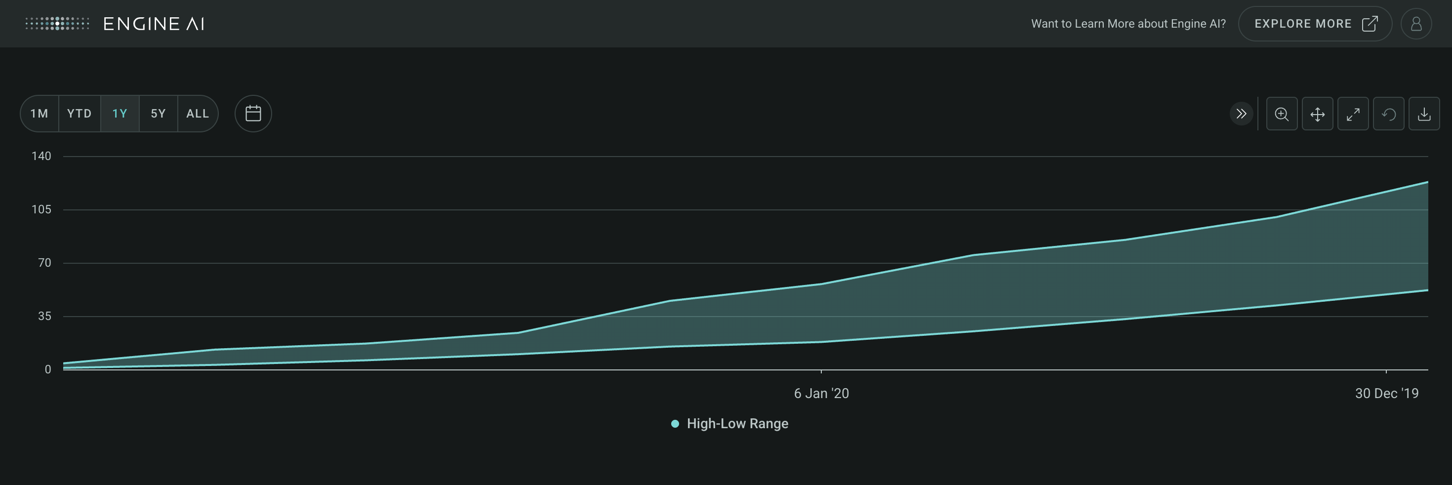
AreaRangeSeries #
AreaRangeSeries(
    *,
    low_data_column: str | WidgetField,
    high_data_column: str | WidgetField,
    name: str | GenericLink,
    styling: Palette | AreaRangeSeriesStyling | None = None,
    entity: Entities | None = None,
    show_in_legend: bool = True,
    required: bool = True,
    visible: bool = True,
    right_axis: bool = False,
    tooltips: TooltipItems | None = None,
)
Visualize data as filled areas between low and high values.
Construct specifications for an area range series within a Timeseries widget to visualize data as filled areas between low and high values on the chart.
Constructor for AreaRangeSeries.
Parameters:
| Name | Type | Description | Default |
|---|---|---|---|
low_data_column
|
str | WidgetField
|
name of column in pandas dataframe(s) used for the low values of this series. |
required |
high_data_column
|
str | WidgetField
|
name of column in pandas dataframe(s) used for the high values of this series. |
required |
name
|
str | GenericLink
|
series name (shown in legend and tooltip). |
required |
styling
|
Palette | AreaRangeSeriesStyling | None
|
styling spec, by default uses the values from the sequential palette. |
None
|
entity
|
Entities | None
|
entity spec. |
None
|
show_in_legend
|
bool
|
whether to show series in legend or not. |
True
|
required
|
bool
|
Flag to make the Series mandatory. If required == True and no Data the widget will show an error. If required==False and no Data, the widget hides the Series. |
True
|
visible
|
bool
|
Flag to make the Series visible when chart is loaded. |
True
|
right_axis
|
bool
|
Flag to make the Series visible on the right axis. |
False
|
tooltips
|
TooltipItems | None
|
tooltip items to be displayed at Series level. |
None
|
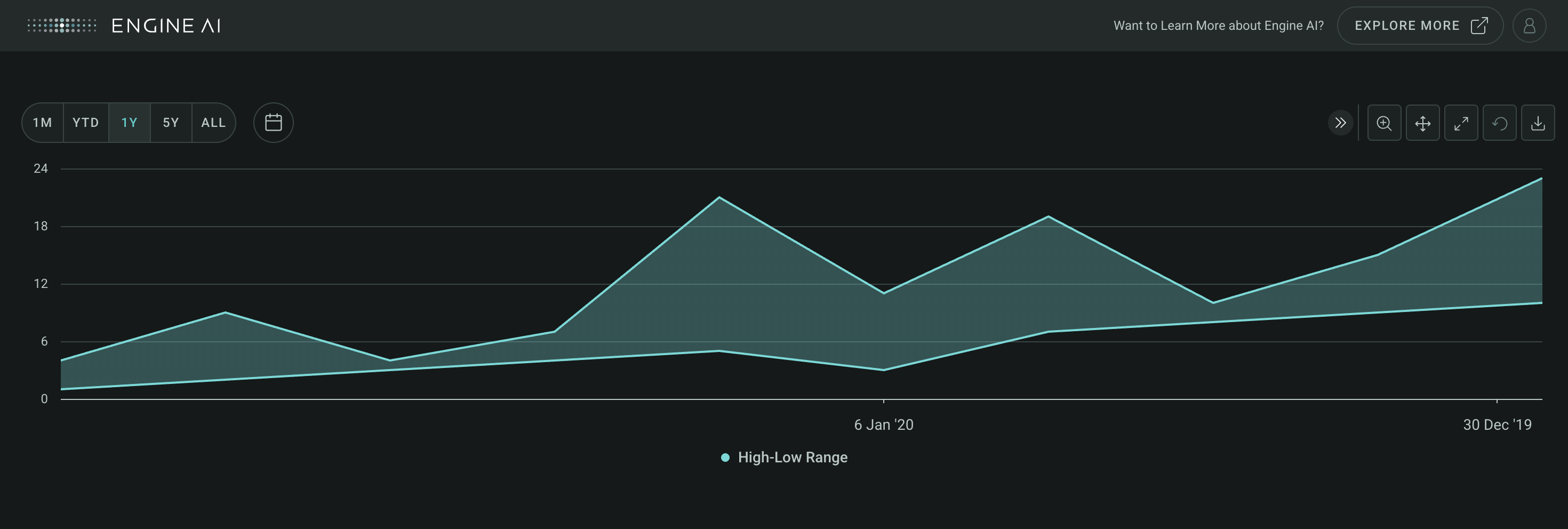
Example:#
Create a Timeseries widget with AreaRangeSeries
import pandas as pd
from engineai.sdk.dashboard.dashboard import Dashboard
from engineai.sdk.dashboard.widgets import timeseries

data = pd.DataFrame(
    {
        "date": pd.date_range("2020-01-01", "2020-01-10"),
        "low": [1, 2, 3, 4, 5, 3, 7, 8, 9, 10],
        "high": [4, 9, 4, 7, 21, 11, 19, 10, 15, 23],
    }
)

timeseries_widget = timeseries.Timeseries(
    data,
    date_column="date",
    charts=[
        timeseries.AreaRangeSeries(
            low_data_column="low",
            high_data_column="high",
            name="High-Low Range",
        )
    ],
)

Dashboard(
    workspace_slug="my-workspace",
    app_slug="my-app",
    slug="first-dashboard",
    content=timeseries_widget,
)
BubbleSeries #
BubbleSeries(
    *,
    data_column: str | WidgetField,
    bubble_size_data_column: str | WidgetField,
    name: str | GenericLink | None = None,
    bubble_name: str | WidgetField | None = None,
    bubble_size_formatting: NumberFormatting | None = None,
    styling: Palette | BubbleSeriesStyling | None = None,
    entity: Entities | None = None,
    show_in_legend: bool = True,
    required: bool = True,
    visible: bool = True,
    right_axis: bool = False,
    tooltips: TooltipItems | None = None,
)
Visualize data with bubbles in Timeseries widget.
Construct specifications for a bubble series within a Timeseries widget. Visually represent data with bubbles on the chart. The size of each bubble corresponds to a specific data value, providing an intuitive way to grasp the magnitude of each data point.
Constructor for BubbleSeries.
Parameters:
| Name | Type | Description | Default |
|---|---|---|---|
data_column
|
str | WidgetField
|
name of column in pandas dataframe(s) used for the values of this series associated with the y axis. |
required |
bubble_size_data_column
|
str | WidgetField
|
name of column in pandas dataframe(s) used for the values of this series associated with the size of the bubble. |
required |
name
|
str | GenericLink | None
|
series name (shown in legend and tooltip). |
None
|
bubble_name
|
str | WidgetField | None
|
name for the bubble value (show in tooltip). |
None
|
bubble_size_formatting
|
NumberFormatting | None
|
formatting spec for size of the bubble (used in tooltip). |
None
|
styling
|
Palette | BubbleSeriesStyling | None
|
styling spec, by default uses the values from the sequential palette. |
None
|
entity
|
Entities | None
|
entity spec. |
None
|
show_in_legend
|
bool
|
whether to show series in legend or not. |
True
|
required
|
bool
|
Flag to make the Series mandatory. If required == True and no Data the widget will show an error. If required==False and no Data, the widget hides the Series. |
True
|
visible
|
bool
|
Flag to make the Series visible when chart is loaded. |
True
|
right_axis
|
bool
|
Flag to make the Series visible on the right axis. |
False
|
tooltips
|
TooltipItems | None
|
tooltip items to be displayed at Series level. |
None
|
add_bubble_transform #
add_bubble_transform(*transform: Transform) -> BubbleSeries
Add transform (i.e. apply transform to series data with high column data).
Returns:
| Name | Type | Description |
|---|---|---|
BubbleSeries |
BubbleSeries
|
reference to this series to facilitate inline manipulation |
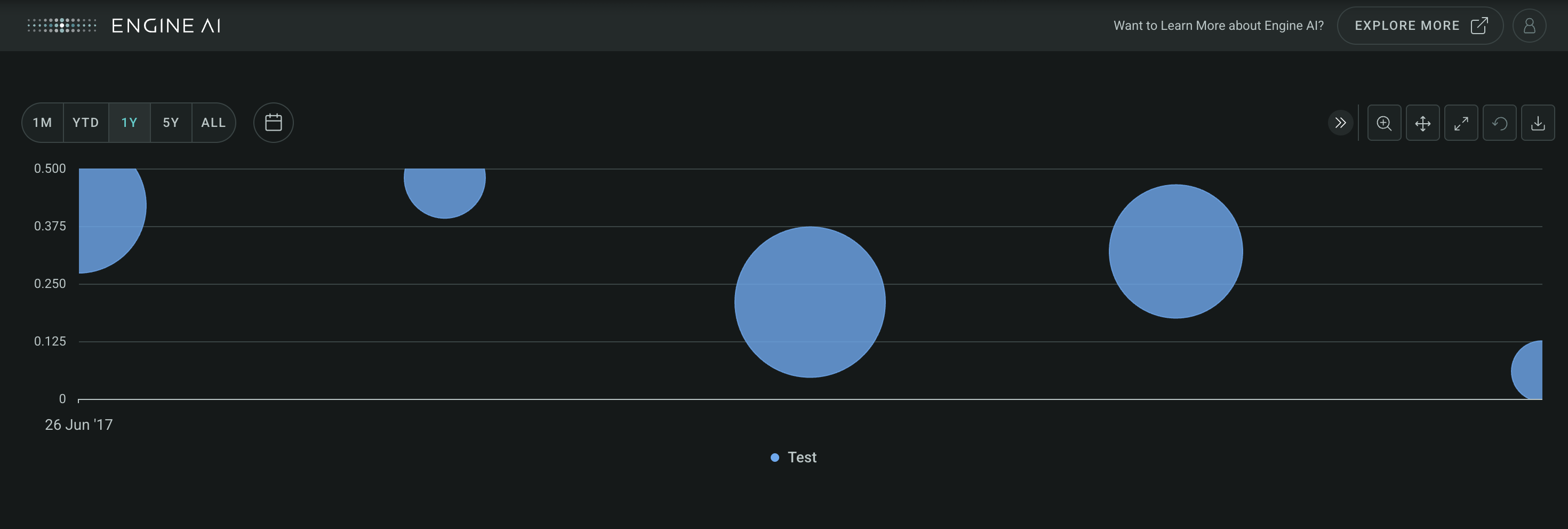
Example:#
Create a Timeseries widget with BubbleSeries
import pandas as pd
from engineai.sdk.dashboard.dashboard import Dashboard
from engineai.sdk.dashboard.widgets import timeseries

data = pd.DataFrame(
    [
        {
            "z": 205,
            "y2": 0.42,
            "date": 1498435200000,
            "country_code": "GB",
        },
        {
            "z": 44,
            "y2": 0.48,
            "date": 1498521600000,
            "country_code": "PT",
        },
        {
            "z": 278,
            "y2": 0.21,
            "date": 1498608000000,
            "country_code": "EC",
        },
        {
            "z": 194,
            "y2": 0.32,
            "date": 1498694400000,
            "country_code": "GB",
        },
        {
            "z": 31,
            "y2": 0.06,
            "date": 1498780800000,
            "country_code": "GB",
        },
    ]
)

data["date"] = pd.to_datetime(data["date"], unit="ms")

timeseries_widget = timeseries.Timeseries(
    data,
    date_column="date",
    charts=[
        timeseries.BubbleSeries(
            name="Test",
            data_column="y2",
            bubble_size_data_column="z",
            bubble_name="TITLE",
        )
    ],
)

Dashboard(
    workspace_slug="my-workspace",
    app_slug="my-app",
    slug="first-dashboard",
    content=timeseries_widget,
)
ColumnSeries #
ColumnSeries(
    *,
    data_column: str | WidgetField,
    name: str | GenericLink | None = None,
    styling: Palette | ColumnSeriesStyling | None = None,
    entity: Entities | None = None,
    show_in_legend: bool = True,
    required: bool = True,
    visible: bool = True,
    right_axis: bool = False,
    tooltips: TooltipItems | None = None,
)
Visualize data as vertical columns in Timeseries widget.
Construct specifications for a column series within a Timeseries widget to visualize data as vertical columns on the chart. Each column represents a distinct data point, with the height of the column reflecting its corresponding value.
Constructor for ColumnSeries.
Parameters:
| Name | Type | Description | Default |
|---|---|---|---|
data_column
|
str | WidgetField
|
name of column in pandas dataframe(s) used for the values of this series. |
required |
name
|
str | GenericLink | None
|
series name (shown in legend and tooltip). |
None
|
styling
|
Palette | ColumnSeriesStyling | None
|
styling spec, by default uses the values from the sequential palette. |
None
|
entity
|
Entities | None
|
entity spec. |
None
|
show_in_legend
|
bool
|
whether to show series in legend or not. |
True
|
required
|
bool
|
Flag to make the Series mandatory. If required == True and no Data the widget will show an error. If required==False and no Data, the widget hides the Series. |
True
|
visible
|
bool
|
Flag to make the Series visible when chart is loaded. |
True
|
right_axis
|
bool
|
Flag to make the Series visible on the right axis. |
False
|
tooltips
|
TooltipItems | None
|
tooltip items to be displayed at Series level. |
None
|
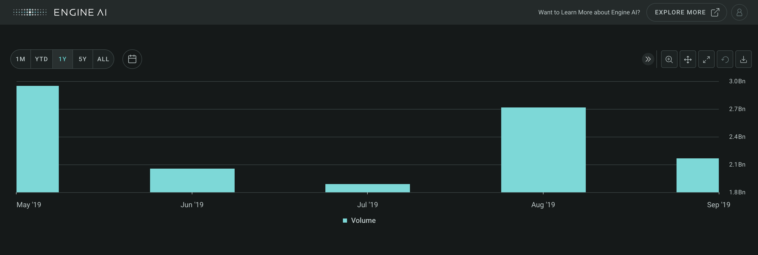
Example:#
Create a Timeseries widget with ColumnSeries
import pandas as pd
from engineai.sdk.dashboard.dashboard import Dashboard
from engineai.sdk.dashboard.widgets import timeseries

data = pd.DataFrame(
    [
        {
            "date": 1556668800000,
            "volume": 2957826400,
        },
        {
            "date": 1559347200000,
            "volume": 2060874800,
        },
        {
            "date": 1561939200000,
            "volume": 1895406800,
        },
        {
            "date": 1564617600000,
            "volume": 2724326400,
        },
        {
            "date": 1567296000000,
            "volume": 2170268400,
        },
    ]
)

data["date"] = pd.to_datetime(data["date"], unit="ms")

timeseries_widget = timeseries.Timeseries(
    data,
    date_column="date",
    charts=[timeseries.ColumnSeries(data_column="volume", right_axis=True)],
)

Dashboard(
    workspace_slug="my-workspace",
    app_slug="my-app",
    slug="first-dashboard",
    content=timeseries_widget,
)
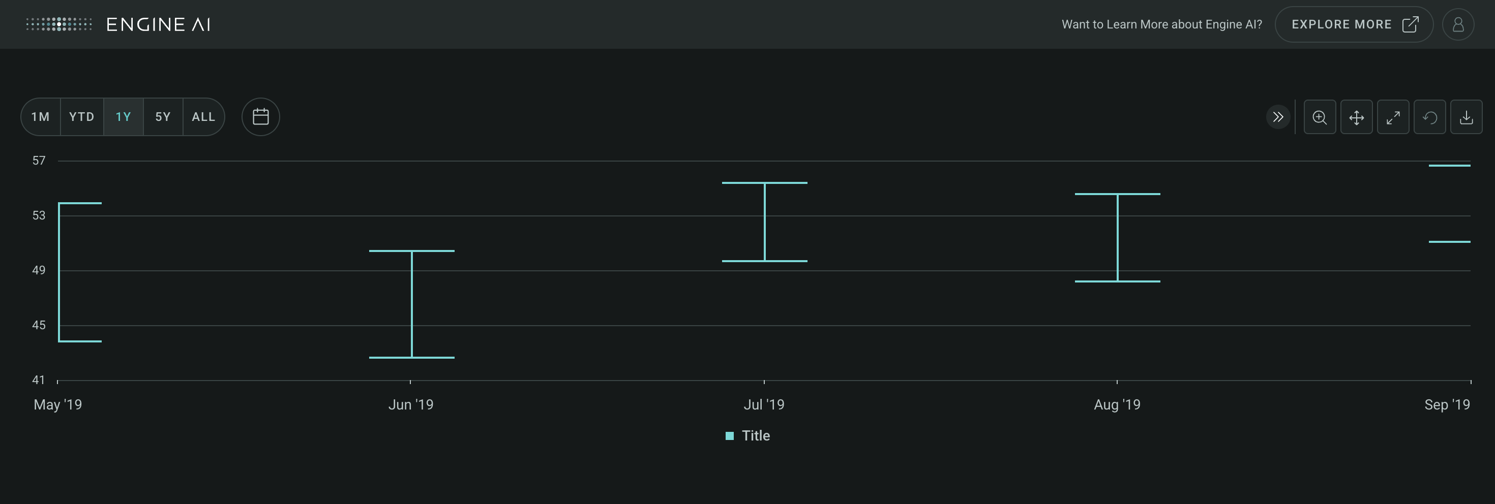
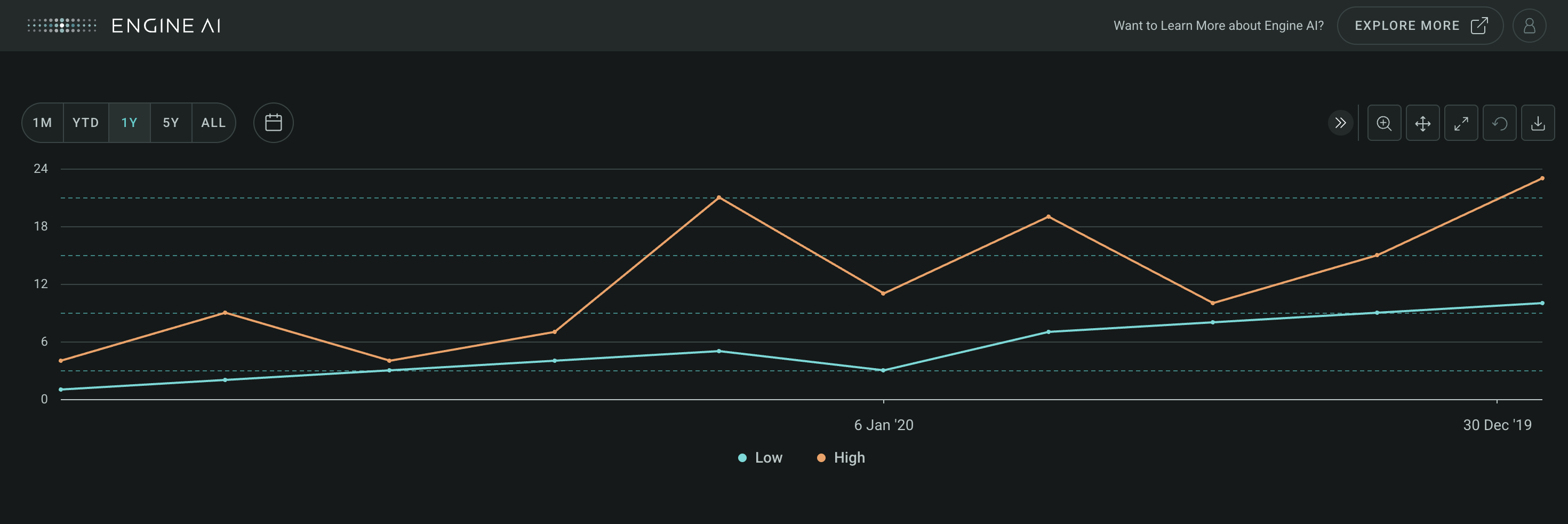
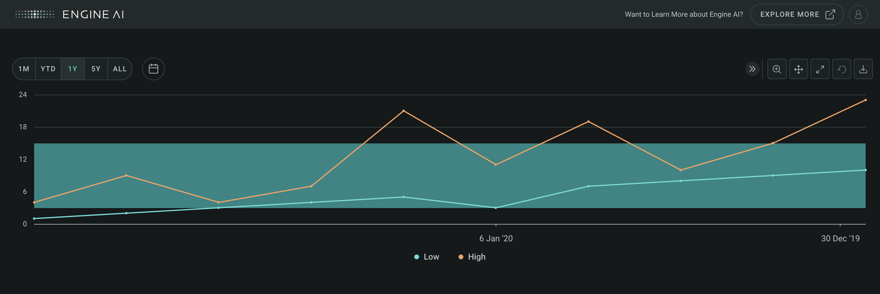
ErrorBarSeries #
ErrorBarSeries(
    *,
    low_data_column: str | WidgetField,
    high_data_column: str | WidgetField,
    name: str | GenericLink | None = None,
    styling: Palette | ErrorBarSeriesStyling | None = None,
    entity: Entities | None = None,
    show_in_legend: bool = True,
    required: bool = True,
    visible: bool = True,
    right_axis: bool = False,
    tooltips: TooltipItems | None = None,
)
Depict data variability with error bars in Timeseries.
Construct specifications for an error bar series within a Timeseries widget, providing a visual representation of the variability or uncertainty associated with data points. Each data point is depicted on the chart along with error bars, which indicate the range of possible values or the extent of deviation from a central value.
Constructor for ErrorBarSeries.
Parameters:
| Name | Type | Description | Default |
|---|---|---|---|
low_data_column
|
str | WidgetField
|
name of data column in pandas dataframe(s) used for the low values of this series. |
required |
high_data_column
|
str | WidgetField
|
name of data column in pandas dataframe(s) used for the high values of this series. |
required |
name
|
str | GenericLink | None
|
series name (shown in legend and tooltip). |
None
|
styling
|
Palette | ErrorBarSeriesStyling | None
|
styling spec, by default uses the values from the sequential palette. |
None
|
entity
|
Entities | None
|
entity spec. |
None
|
show_in_legend
|
bool
|
whether to show series in legend or not. |
True
|
required
|
bool
|
Flag to make the Series mandatory. If required == True and no Data the widget will show an error. If required==False and no Data, the widget hides the Series. |
True
|
visible
|
bool
|
Flag to make the Series visible when chart is loaded. |
True
|
right_axis
|
bool
|
Flag to make the Series visible on the right axis. |
False
|
tooltips
|
TooltipItems | None
|
tooltip items to be displayed at Series level. |
None
|
Example:#
Create a Timeseries widget with ErrorBarSeries
import pandas as pd
from engineai.sdk.dashboard.dashboard import Dashboard
from engineai.sdk.dashboard.widgets import timeseries

data = pd.DataFrame(
    [
        {
            "date": 1556668800000,
            "high": 53.83,
            "low": 43.75,
        },
        {
            "date": 1559347200000,
            "high": 50.39,
            "low": 42.57,
        },
        {
            "date": 1561939200000,
            "high": 55.34,
            "low": 49.6,
        },
        {
            "date": 1564617600000,
            "high": 54.51,
            "low": 48.14,
        },
        {
            "date": 1567296000000,
            "high": 56.6,
            "low": 51.06,
        },
    ]
)

data["date"] = pd.to_datetime(data["date"], unit="ms")

timeseries_widget = timeseries.Timeseries(
    data,
    date_column="date",
    charts=[
        timeseries.ErrorBarSeries(
            name="Title", low_data_column="low", high_data_column="high"
        )
    ],
)

Dashboard(
    workspace_slug="my-workspace",
    app_slug="my-app",
    slug="first-dashboard",
    content=timeseries_widget,
)
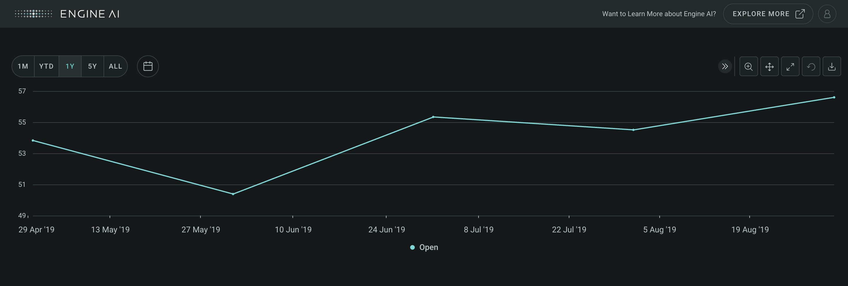
LineSeries #
LineSeries(
    *,
    data_column: str | WidgetField,
    name: str | GenericLink | None = None,
    styling: Palette | LineSeriesStyling | None = None,
    entity: Entities | None = None,
    show_in_legend: bool = True,
    required: bool = True,
    visible: bool = True,
    right_axis: bool = False,
    tooltips: TooltipItems | None = None,
)
Visualize data with continuous lines in Timeseries.
Construct specifications for a line series within a Timeseries widget to visualize data as a continuous line connecting data points on the chart. Each data point represents a specific value along the timeline, and the lines provide a clear depiction of the trends and patterns present in the data.
Constructor for LineSeries.
Parameters:
| Name | Type | Description | Default |
|---|---|---|---|
data_column
|
str | WidgetField
|
name of column in pandas dataframe(s) used for the values of this series. |
required |
name
|
str | GenericLink | None
|
series name (shown in legend and tooltip). |
None
|
styling
|
Palette | LineSeriesStyling | None
|
styling spec, by default uses the values from the sequential palette. |
None
|
entity
|
Entities | None
|
entity spec. |
None
|
show_in_legend
|
bool
|
whether to show series in legend or not. |
True
|
required
|
bool
|
Flag to make the Series mandatory. If required == True and no Data the widget will show an error. If required==False and no Data, the widget hides the Series. |
True
|
visible
|
bool
|
Flag to make the Series visible when chart is loaded. |
True
|
right_axis
|
bool
|
Flag to make the Series visible on the right axis. |
False
|
tooltips
|
TooltipItems | None
|
tooltip items to be displayed at Series level. |
None
|
Example:#
Create a Timeseries widget with LineSeries
import pandas as pd
from engineai.sdk.dashboard.dashboard import Dashboard
from engineai.sdk.dashboard.widgets import timeseries

data = pd.DataFrame(
    [
        {
            "date": 1556668800000,
            "open": 53.83,
        },
        {
            "date": 1559347200000,
            "open": 50.39,
        },
        {
            "date": 1561939200000,
            "open": 55.34,
        },
        {
            "date": 1564617600000,
            "open": 54.51,
        },
        {
            "date": 1567296000000,
            "open": 56.6,
        },
    ]
)

data["date"] = pd.to_datetime(data["date"], unit="ms")

timeseries_widget = timeseries.Timeseries(
    data,
    date_column="date",
    charts=[
        timeseries.LineSeries(data_column="open"),
    ],
)

Dashboard(
    workspace_slug="my-workspace",
    app_slug="my-app",
    slug="first-dashboard",
    content=timeseries_widget,
)
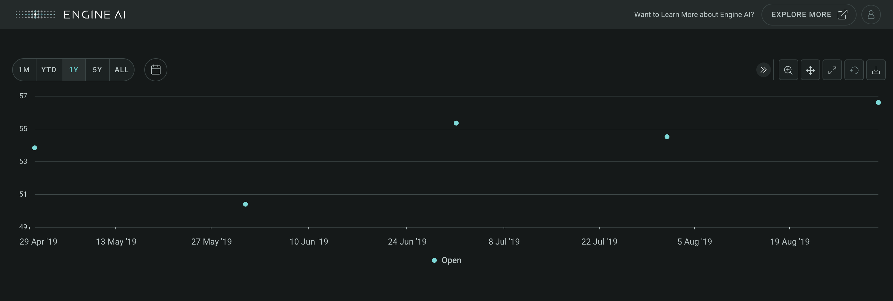
PointSeries #
PointSeries(
    *,
    data_column: str | WidgetField,
    name: str | GenericLink | None = None,
    styling: Palette | PointSeriesStyling | None = None,
    entity: Entities | None = None,
    show_in_legend: bool = True,
    required: bool = True,
    visible: bool = True,
    right_axis: bool = False,
    tooltips: TooltipItems | None = None,
)
Visualize individual data points in Timeseries.
Construct specifications for a point series within a Timeseries widget, enabling users to visualize individual data points on the chart as distinct markers. Each marker represents a specific data value, providing a clear and concise depiction of the data distribution over time.
Constructor for PointSeries.
Parameters:
| Name | Type | Description | Default |
|---|---|---|---|
data_column
|
str | WidgetField
|
name of column in pandas dataframe(s) used for the values of this series. |
required |
name
|
str | GenericLink | None
|
series name (shown in legend and tooltip). |
None
|
styling
|
Palette | PointSeriesStyling | None
|
styling spec, by default uses the values from the sequential palette. |
None
|
entity
|
Entities | None
|
entity spec. |
None
|
show_in_legend
|
bool
|
whether to show series in legend or not. |
True
|
required
|
bool
|
Flag to make the Series mandatory. If required == True and no Data the widget will show an error. If required==False and no Data, the widget hides the Series. |
True
|
visible
|
bool
|
Flag to make the Series visible when chart is loaded. |
True
|
right_axis
|
bool
|
Flag to make the Series visible on the right axis. |
False
|
tooltips
|
TooltipItems | None
|
tooltip items to be displayed at Series level. |
None
|
Example:#
Create a Timeseries widget with PointSeries
import pandas as pd
from engineai.sdk.dashboard.dashboard import Dashboard
from engineai.sdk.dashboard.widgets import timeseries

data = pd.DataFrame(
    [
        {
            "date": 1556668800000,
            "open": 53.83,
        },
        {
            "date": 1559347200000,
            "open": 50.39,
        },
        {
            "date": 1561939200000,
            "open": 55.34,
        },
        {
            "date": 1564617600000,
            "open": 54.51,
        },
        {
            "date": 1567296000000,
            "open": 56.6,
        },
    ]
)

data["date"] = pd.to_datetime(data["date"], unit="ms")

timeseries_widget = timeseries.Timeseries(
    data,
    date_column="date",
    charts=[
        timeseries.PointSeries(data_column="open"),
    ],
)

Dashboard(
    workspace_slug="my-workspace",
    app_slug="my-app",
    slug="first-dashboard",
    content=timeseries_widget,
)
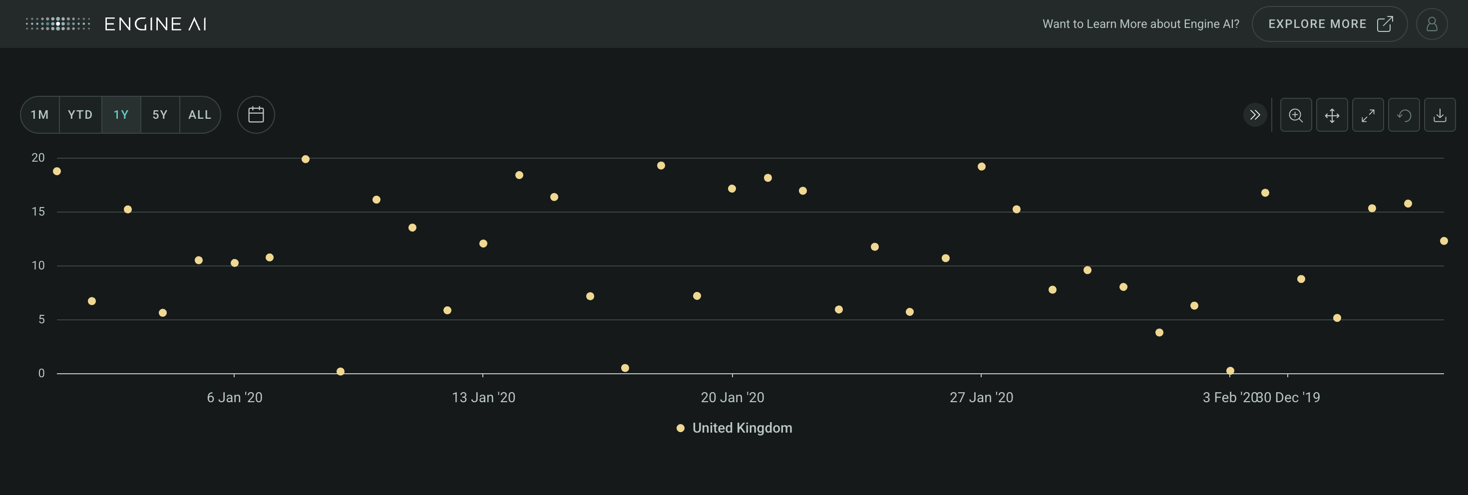
ScatterSeries #
ScatterSeries(
    *,
    data_column: str | WidgetField,
    name: str | GenericLink | None = None,
    styling: Palette | ScatterSeriesStyling | None = None,
    entity: Entities | None = None,
    show_in_legend: bool = True,
    required: bool = True,
    visible: bool = True,
    right_axis: bool = False,
    tooltips: TooltipItems | None = None,
)
Visualize data as individual points in Timeseries.
Construct specifications for a scatter series within a Timeseries widget to visualize data as individual points on the chart without any connections between them. Each data point is represented by a distinct marker, providing a clear depiction of the data distribution over time.
Constructor for ScatterSeries.
Parameters:
| Name | Type | Description | Default |
|---|---|---|---|
data_column
|
str | WidgetField
|
name of column in pandas dataframe(s) used for the values of this series. |
required |
name
|
str | GenericLink | None
|
series name (shown in legend and tooltip). |
None
|
styling
|
Palette | ScatterSeriesStyling | None
|
styling spec, by default uses the values from the sequential palette. |
None
|
entity
|
Entities | None
|
entity spec. |
None
|
show_in_legend
|
bool
|
whether to show series in legend or not. |
True
|
required
|
bool
|
Flag to make the Series mandatory. If required == True and no Data the widget will show an error. If required==False and no Data, the widget hides the Series. |
True
|
visible
|
bool
|
Flag to make the Series visible when chart is loaded. |
True
|
right_axis
|
bool
|
Flag to make the Series visible on the right axis. |
False
|
tooltips
|
TooltipItems | None
|
tooltip items to be displayed at Series level. |
None
|
Example:#
Create a Timeseries widget with ScatterSeries
import pandas as pd
import numpy as np
import datetime

from engineai.sdk.dashboard.dashboard import Dashboard
from engineai.sdk.dashboard.widgets import timeseries
from engineai.sdk.dashboard.styling import color

data = pd.DataFrame(
    {
        "open": np.random.uniform(low=0, high=20, size=(40,)),
        "date": pd.date_range(datetime.datetime(2020, 1, 1), periods=40, freq="D"),
    }
)

data["date"] = pd.to_datetime(data["date"])

timeseries_widget = timeseries.Timeseries(
    data,
    date_column="date",
    charts=[
        timeseries.ScatterSeries(
            data_column="open",
            styling=timeseries.ScatterSeriesStyling(
                color_spec=color.Palette.BANANA_YELLOW,
            ),
            entity=timeseries.CountryEntity(country_code="GB"),
        ),
    ],
)

Dashboard(
    workspace_slug="my-workspace",
    app_slug="my-app",
    slug="first-dashboard",
    content=timeseries_widget,
)
Transform#
Transform #
Transform(
    *,
    transform: TransformChoices,
    scalar: int | float | None = None,
)
Modify data representation in Timeseries with various transformations.
Define specifications for transforming data within a Timeseries widget to modify or enhance the representation of data series. Select from a range of transformation choices to apply to the data, such as scaling, normalization, or logarithmic transformation, depending on analytical needs.
Constructor for Transform.
Parameters:
| Name | Type | Description | Default |
|---|---|---|---|
transform
|
TransformChoices
|
transform to apply to series data. |
required |
scalar
|
int | float | None
|
Applies scalar value to data. Only applies when using the following transformations ADD, SUBTRACT, DIVIDE and MULTIPLY. |
None
|
TransformChoices #
Options for transforming data within Timeseries legend.
Below are the various options for transformations of timeseries data within a Timeseries widget's legend.
Attributes:
| Name | Type | Description |
|---|---|---|
CUMSUM |
Transform series to the cumulative sum of its values. |
|
CUMPROD |
Transform series to the cumulative product of its values. |
|
CUMRETURNPROD |
Similar to CUMPROD but fixes the initial value as 0. Example used is to represent Return on Investment. |
|
CUMRETURNSUM |
Similar to CUMSUM but fixes the initial value as 0. Example used is to represent Return on Investment. |
|
DRAWDOWN |
Calculates drawdown based on the series values. Main use is to measure the decline of an investment from its peak value to its trough value. |
|
INDEX |
Transforms the values to an index where the first value is 100 and the rest of the values follow the relative changes of the original data. |
|
ADD |
Adds a scalar to all values in the series. |
|
SUBTRACT |
Subtracts a scalar to all values in the series. |
|
DIVIDE |
Divides a scalar to all values in the series. |
|
MULTIPLY |
Multiplies a scalar to all values in the series. |
Create a Timeseries widget with cumulative sum transform
import pandas as pd
from engineai.sdk.dashboard.dashboard import Dashboard
from engineai.sdk.dashboard.widgets import timeseries

data = pd.DataFrame(
    {
        "date": pd.date_range("2020-01-01", "2020-01-10"),
        "low": [1, 2, 3, 4, 5, 3, 7, 8, 9, 10],
        "high": [4, 9, 4, 7, 21, 11, 19, 10, 15, 23],
    }
)

timeseries_widget = timeseries.Timeseries(
    data,
    date_column="date",
    charts=[
        timeseries.AreaRangeSeries(
            low_data_column="low",
            high_data_column="high",
            name="High-Low Range",
        ).add_transforms(
            timeseries.Transform(transform=timeseries.TransformChoices.CUMSUM)
        )
    ],
)

Dashboard(
    workspace_slug="my-workspace",
    app_slug="my-app",
    slug="my-dashboard",
    content=timeseries_widget,
)
Enums#
DashStyle #
Enum to specify dash style of lines.
Attributes:
| Name | Type | Description |
|---|---|---|
SOLID |
Solid line. |
|
DOT |
Dotted line. |
|
DASH |
Dashed line. |
|
SHORT_DASH |
Short dashed line. |
|
LONG_DASH |
Long dashed line. |
|
SHORT_DASH_DOT |
Short dashed dotted line. |
|
LONG_DASH_DOT |
Long dashed dotted line. |
MarkerSymbol #
Enum to specify marker symbol.
Attributes:
| Name | Type | Description |
|---|---|---|
CROSS |
Cross symbol. |
|
TRIANGLE |
Triangle symbol. |
|
CIRCLE |
Circle symbol. |
|
DIAMOND |
Diamond symbol. |
|
SQUARE |
Square symbol. |
|
TRIANGLE_DOWN |
Triangle down symbol. |
LegendPosition #
Chart legend position options.
Options for positions of charts legend.
Attributes:
| Name | Type | Description |
|---|---|---|
RIGHT |
str
|
Legend is placed to the right of the chart. |
BOTTOM |
str
|
Legend is placed below the chart. |
RIGHT_GROUPED |
str
|
Legend is placed to the right of the chart and grouped with other legends. |
BOTTOM_GROUPED |
str
|
Legend is placed below the chart and grouped with other legends. |
NEXT_TO_DATA |
str
|
Legend is placed next to the data. |
Axis lines and bands#
AxisLine #
AxisLine(
    data: DataType | DataFrame,
    *,
    data_column: str,
    label: str | AxisLabel | None = None,
    styling: Palette | AxisLineStyling | None = None,
    dash_style: DashStyle = DASH,
)
Spec for Axis Line.
Construct a plot line for an axis.
Parameters:
| Name | Type | Description | Default |
|---|---|---|---|
data
|
DataType | DataFrame
|
data source for the Axis line. |
required |
data_column
|
str
|
name of column in pandas dataframe(s) used for the value of axis line |
required |
label
|
str | AxisLabel | None
|
label annotation. |
None
|
styling
|
Palette | AxisLineStyling | None
|
specs for chart band styling. |
None
|
dash_style
|
DashStyle
|
line dash style. |
DASH
|
Create a Timeseries widget with four y-axis lines
import pandas as pd
from engineai.sdk.dashboard.dashboard import Dashboard
from engineai.sdk.dashboard.widgets import timeseries

data = pd.DataFrame(
    {
        "date": pd.date_range("2020-01-01", "2020-01-10"),
        "low": [1, 2, 3, 4, 5, 3, 7, 8, 9, 10],
        "high": [4, 9, 4, 7, 21, 11, 19, 10, 15, 23],
    }
)

line = timeseries.AxisLine(
    data=pd.DataFrame(data={"threshold": [3, 9, 15, 21]}), data_column="threshold"
)

timeseries_widget = timeseries.Timeseries(
    data,
    date_column="date",
    charts=[
        timeseries.Chart(
            left_y_axis=timeseries.YAxis(series=["low", "high"], line=line),
        )
    ],
)

Dashboard(
    workspace_slug="my-workspace",
    app_slug="my-app",
    slug="my-dashboard",
    content=timeseries_widget,
)
AxisBand #
AxisBand(
    data: DataType | DataFrame,
    *,
    from_column: str,
    to_column: str,
    label: str | AxisLabel | None = None,
    styling: Palette | AxisBandStyling | None = None,
)
Spec for Axis Band.
Construct a plot line for an axis.
Parameters:
| Name | Type | Description | Default |
|---|---|---|---|
data
|
DataType | DataFrame
|
data source for the Axis Band. |
required |
from_column
|
str
|
name of column in pandas dataframe(s) used for the start value for the band. |
required |
to_column
|
str
|
name of column in pandas dataframe(s) used for the end value for the band. |
required |
label
|
str | AxisLabel | None
|
label annotation. |
None
|
styling
|
Palette | AxisBandStyling | None
|
specs for chart band styling. |
None
|
Create a Timeseries widget with an y-axis band
import pandas as pd
from engineai.sdk.dashboard.dashboard import Dashboard
from engineai.sdk.dashboard.widgets import timeseries

data = pd.DataFrame(
    {
        "date": pd.date_range("2020-01-01", "2020-01-10"),
        "low": [1, 2, 3, 4, 5, 3, 7, 8, 9, 10],
        "high": [4, 9, 4, 7, 21, 11, 19, 10, 15, 23],
    }
)

band = timeseries.AxisBand(
    data=pd.DataFrame(data={"from": [3], "to": [15]}),
    from_column="from",
    to_column="to",
)

timeseries_widget = timeseries.Timeseries(
    data,
    date_column="date",
    charts=[
        timeseries.Chart(
            left_y_axis=timeseries.YAxis(series=["low", "high"], band=band),
        )
    ],
)

Dashboard(
    workspace_slug="my-workspace",
    app_slug="my-app",
    slug="my-dashboard",
    content=timeseries_widget,
)
AxisLabel #
AxisLabel(
    *,
    text: str | DataField | None = None,
    x_position: int | DataField = -5,
    y_position: int | DataField = 2,
    horizontal_align: HorizontalAlignment = CENTER,
    vertical_align: VerticalAlignment = TOP,
    rotation: float | int | None = -90,
)
Spec for label of axis band or line.
Construct spec for label of axis band or line.
Parameters:
| Name | Type | Description | Default |
|---|---|---|---|
text
|
str | DataField | None
|
name of column in pandas dataframe(s) used for the label text. |
None
|
x_position
|
int | DataField
|
name of column in pandas dataframe(s) used for the x value for the label position. |
-5
|
y_position
|
int | DataField
|
name of column in pandas dataframe(s) used for they value for the label position. |
2
|
horizontal_align
|
HorizontalAlignment
|
horizontal alignment spec. |
CENTER
|
vertical_align
|
VerticalAlignment
|
vertical alignment spec. |
TOP
|
rotation
|
float | int | None
|
Rotation of the text label in degrees. |
-90
|
Create a Timeseries widget a labeled y-axis band
import pandas as pd
from engineai.sdk.dashboard.dashboard import Dashboard
from engineai.sdk.dashboard.widgets import timeseries
from engineai.sdk.dashboard.enum.align import VerticalAlignment

data = pd.DataFrame(
    {
        "date": pd.date_range("2020-01-01", "2020-01-10"),
        "low": [1, 2, 3, 4, 5, 3, 7, 8, 9, 10],
        "high": [4, 9, 4, 7, 21, 11, 19, 10, 15, 23],
    }
)

band = timeseries.AxisBand(
    data=pd.DataFrame(data={"from": [3], "to": [15]}),
    from_column="from",
    to_column="to",
    label=timeseries.AxisLabel(
        text="Band label text",
        rotation=0,
        y_position=15,
        vertical_align=VerticalAlignment.BOTTOM,
    ),
)

timeseries_widget = timeseries.Timeseries(
    data,
    date_column="date",
    charts=[
        timeseries.Chart(
            left_y_axis=timeseries.YAxis(series=["low", "high"], band=band),
        )
    ],
)

Dashboard(
    workspace_slug="my-workspace",
    app_slug="my-app",
    slug="my-dashboard",
    content=timeseries_widget,
)

Types#
BubbleSeriesStyling
module-attribute
#
BubbleSeriesStyling = (
    BubbleCircleSeriesStyling | BubbleCountrySeriesStyling
)
TimeseriesSeries
module-attribute
#
TimeseriesSeries = (
    LineSeries
    | AreaSeries
    | AreaRangeSeries
    | ColumnSeries
    | BubbleSeries
    | ScatterSeries
    | ErrorBarSeries
    | PointSeries
    | TimeseriesBaseSeries
)